Coca-Cola One Brand
@ Tátil Design de Ideias
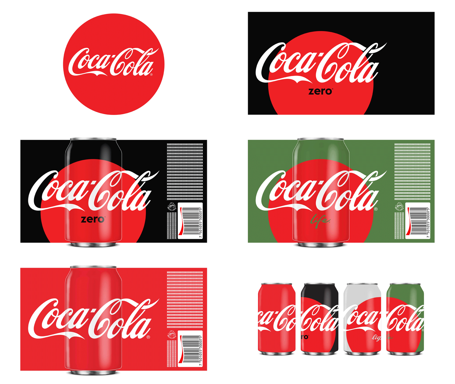
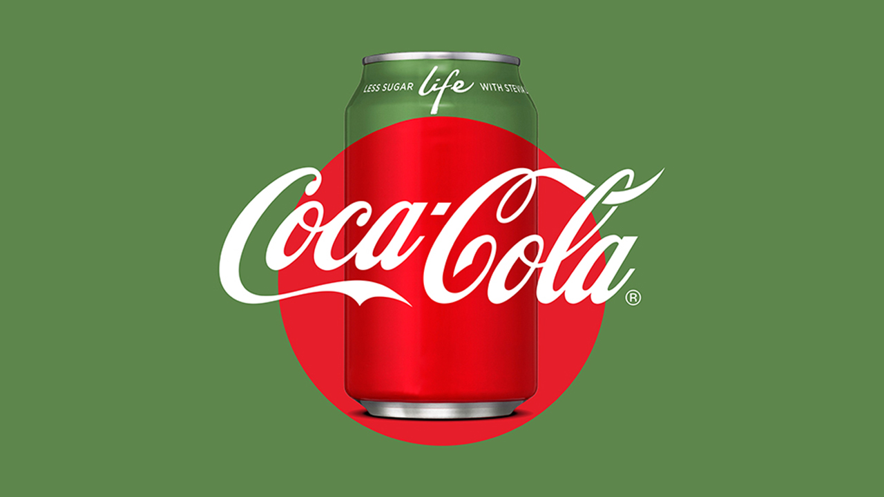
Designing the new packaging for one the world’s most iconic brands is in itself a big deal. But this time, the challenge we shared with five other international agencies (BVD, SDL, Moniker, Hey Studio and United Design) as well as the Coca-Cola Global Design team, had an extra spark: how to unify multiple brands through design. We needed to develop a single identity system that visually integrated all packaging variants (Coca-Cola Classic, Coca-Cola Diet, Coca-Cola Zero Sugar and Coca-Cola Life) and that conveyed across all products a single promise, a single refreshment, a single Coca-Cola.
Throughout the design process we identified the classic, emblematic, iconic ‘Red Disc’ as the element capable of visually unifying all packaging variants. The ‘Red Disc’ was first introduced in 1930 and since then it has always been part of the Coca-Cola history, truly encapsulating the brand’s essence.
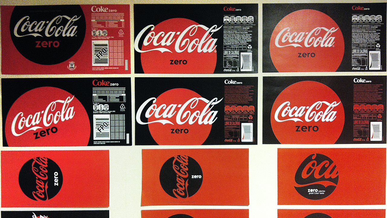
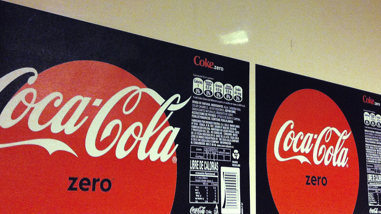
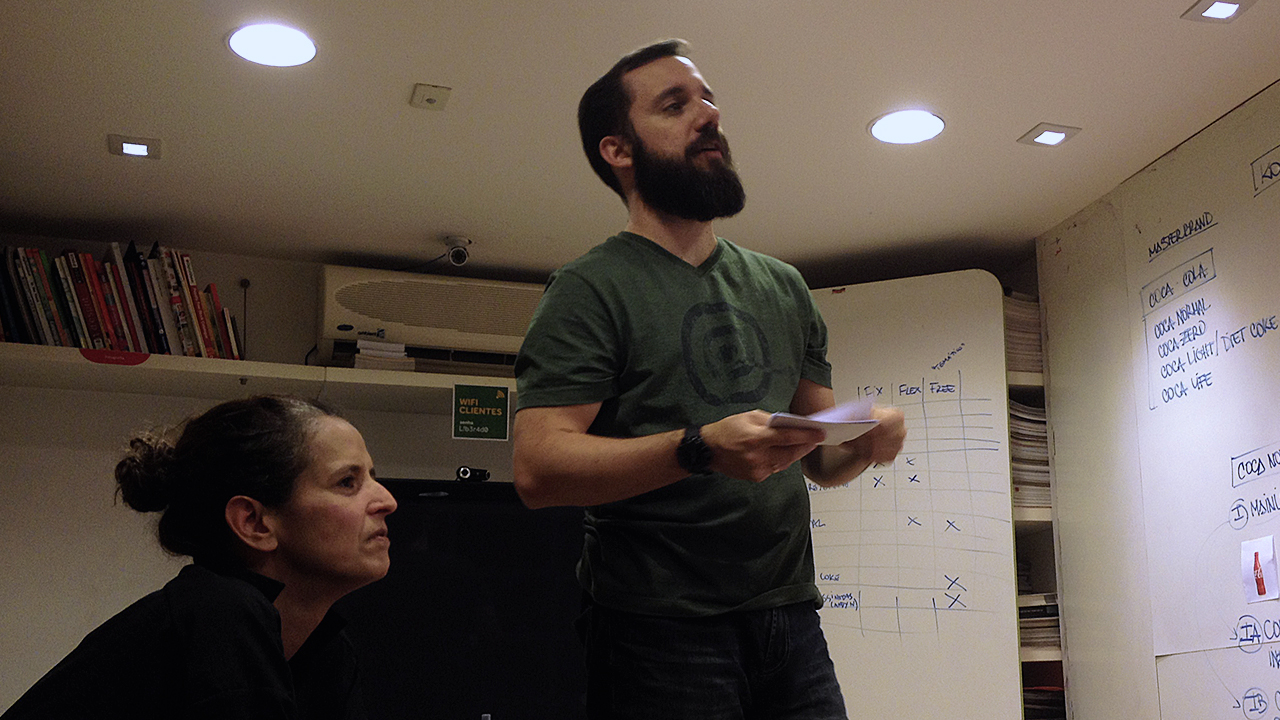
Hundreds of sketches, inspirations, possibilities and ideas were explored in a collaborative journey leading us to our final destination: a modular system that can be applied across all global forms of packaging and which builds a single Coca-Cola: authentic, refreshing, uplifting; the power of red.
For the first time in 130 years the packaging uses an unexpected yet contemporary way of refreshing the classic ‘Red Disc’ whilst at the same instilling the Coca-Cola signature across all products in a prominent way.
++ TATIL DESIGN DE IDEIAS
CEO
Fred Gelli
Creative Team
Ricardo Bezerra, Cecilia Costa, Daniel Souza, Ilana Bandarovsky, Mariana Hermeto, Renan Benvenuti, Bruna Aragão, Fabrizzio Nascimento
Account Management Mariana Soccodato, Camila Rodrigues
++ COCA-COLA DESIGN TEAM James Sommerville; Raphael Abreu; Cris Grether
Project designed in partnership with BVD, SDL, Moniker, Hey Studio and United Design
Awards . Brazilian Graphic Design Biennial





Daniel Souza © 2025.
All rights reserved.
