


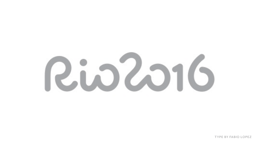
Rio2016 Olympic Games Brand
@ Tátil Design de Ideias
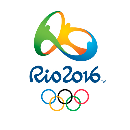
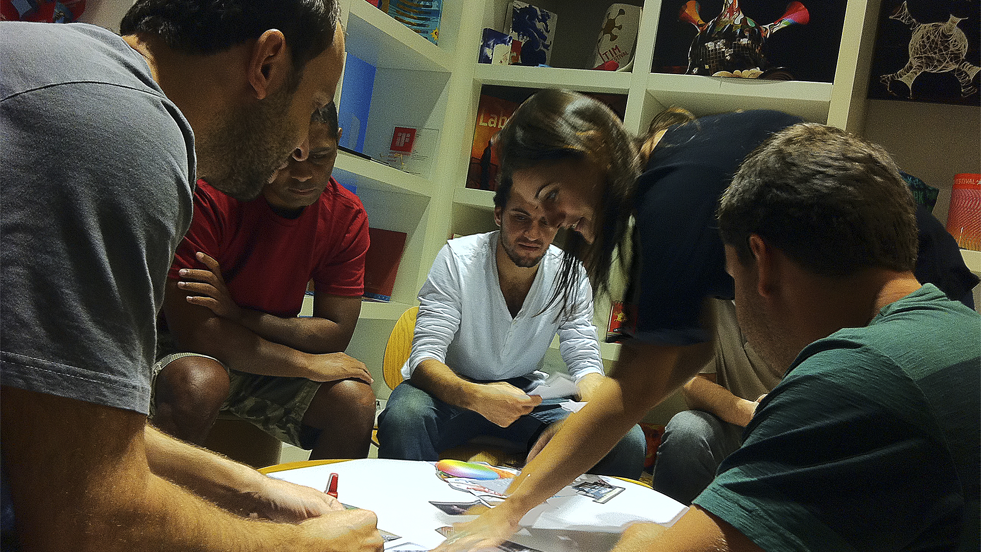
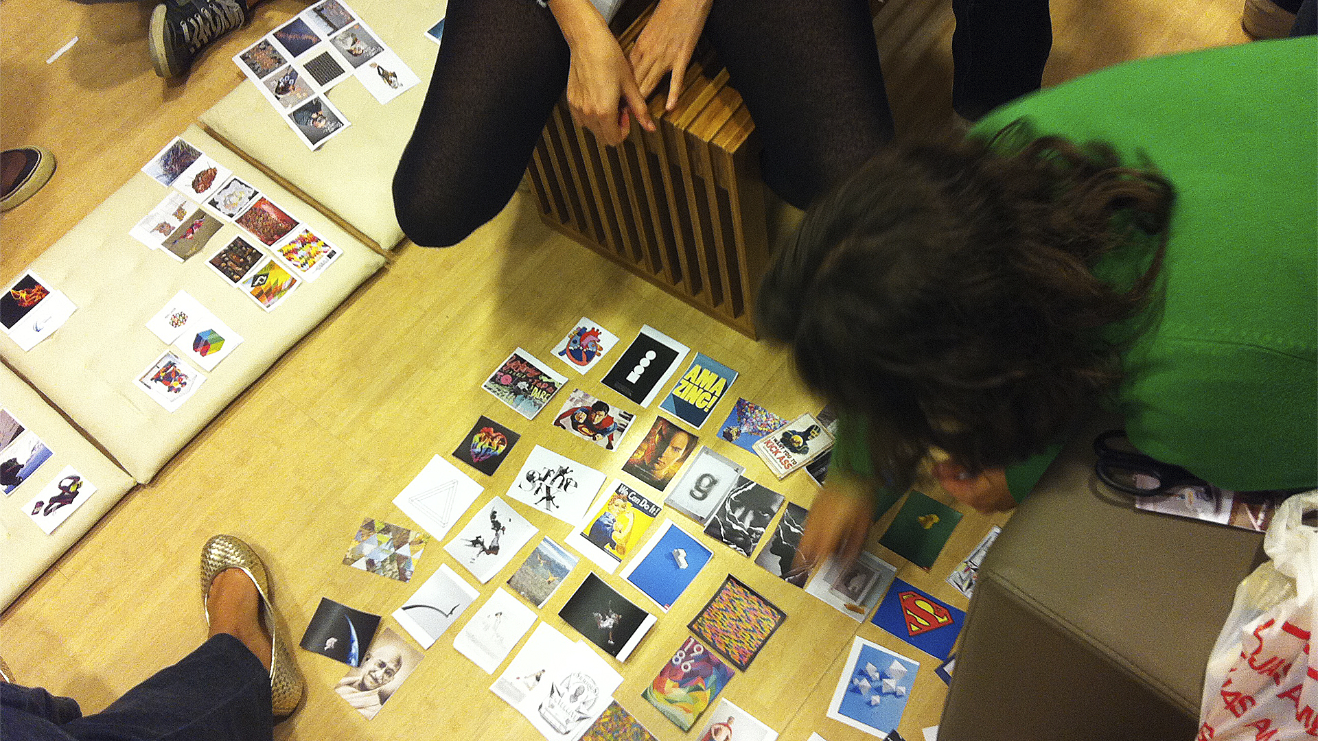
In 2010, after Rio de Janeiro was chosen as the host city for the 2016 Olympic Games, the largest pitch process in the Brazilian design market was set up to create the brand of the games. The dream project of any designer. The most valuable non-commercial brand in the world and the most complex visual identity system of the planet. A project so grand and coveted that it gathered 139 Brazilian agencies.
The mission: to translate into a single symbol what makes Olympics in Rio unique games. A brand that had to express unity, inspire achievement, optimism and that would impact millions around the world. A briefing based on 12 very challenging items:
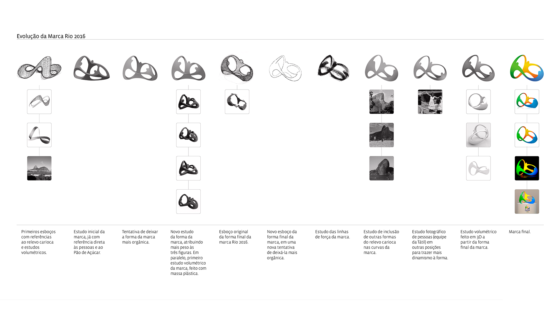
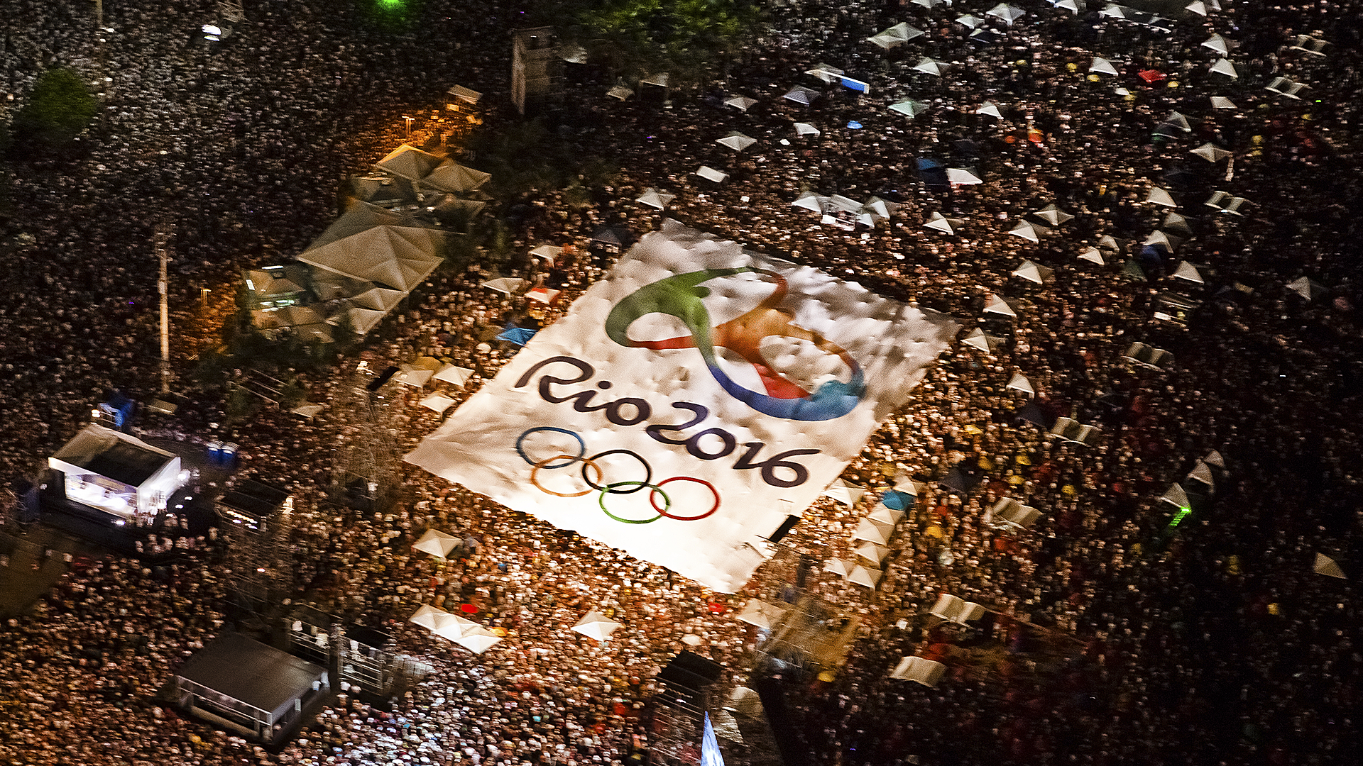
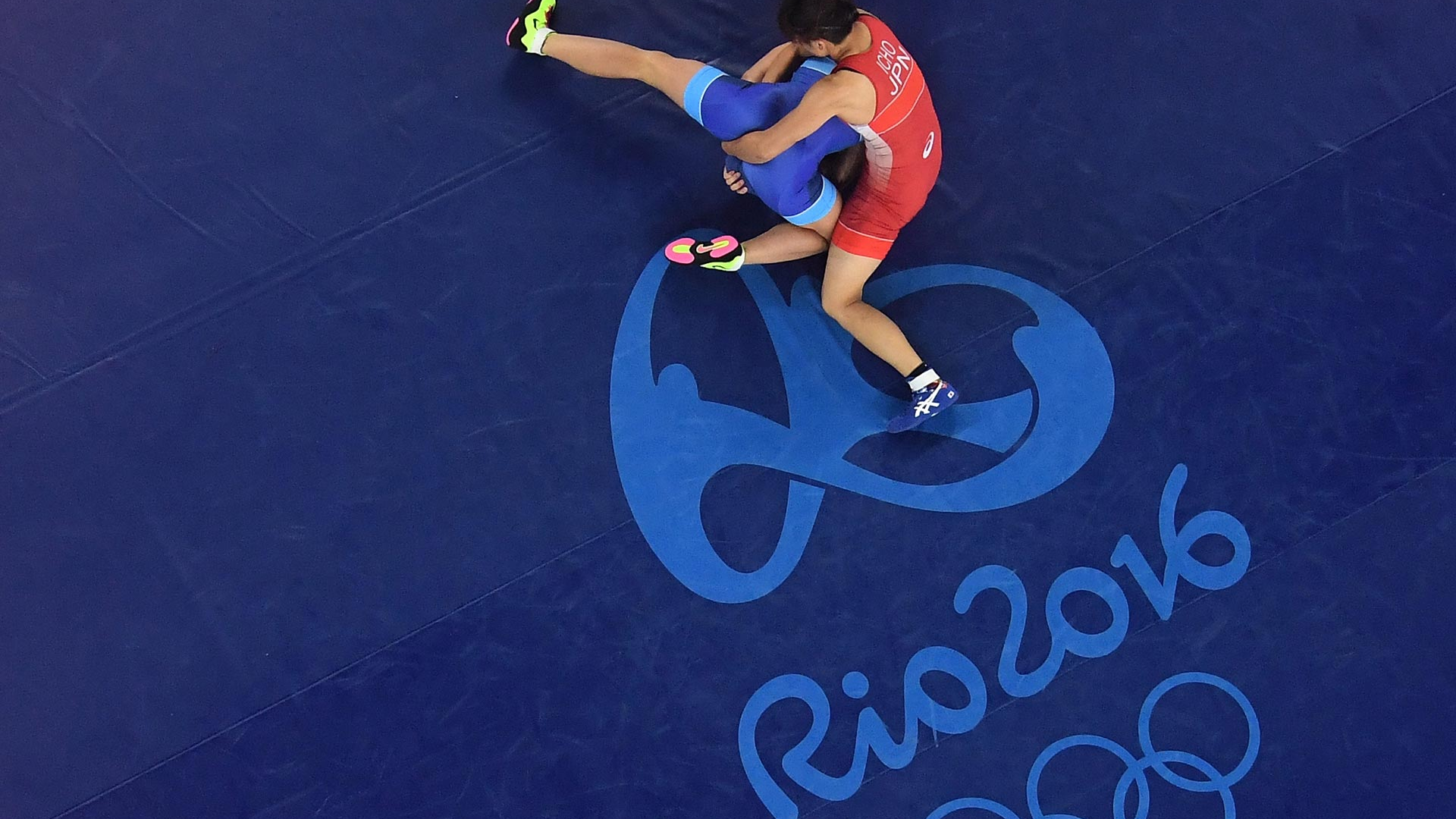
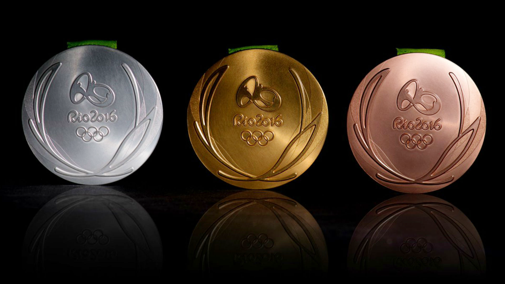
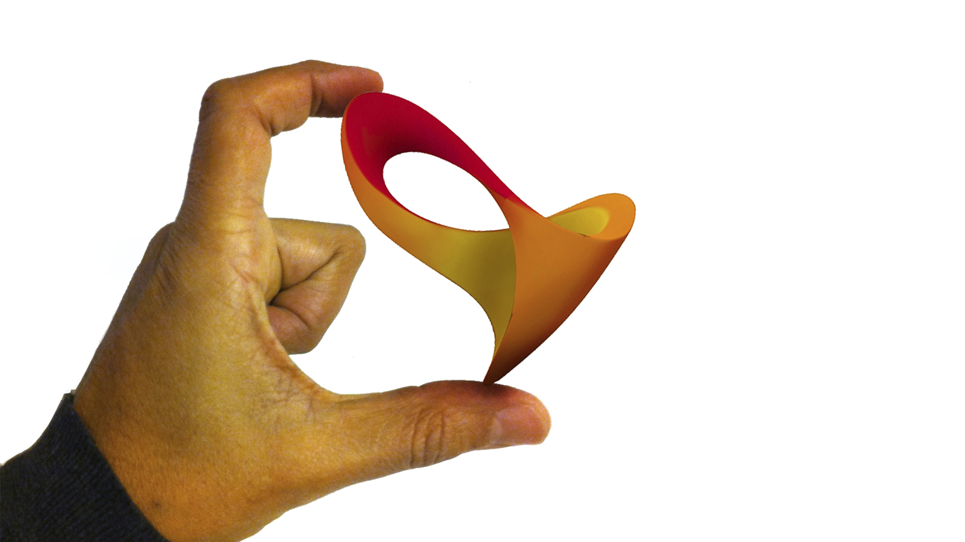
The result is a truly human brand, one that conveys a mix of ethnicities, athletes and cultures. A brand that embraces and celebrates with passion. A form that reveals the Sugarloaf and reflects the exuberant nature of both the city and the Carioca. A sculpture-brand, infinite, and three-dimensional that acquires texture, takes shape, and becomes an object to be experienced. It’s the first-ever three-dimensional brand of the Olympic Games. The most highly valued brand in the history of the Games.
We developed strategic tools that guided the work done by other partners, and helped manage the brand and its alignment across all brand expressions.
The result is a powerful and consistent brand that has continued relevance across audiences and time.
The mission: to translate into a single symbol what makes Olympics in Rio unique games. A brand that had to express unity, inspire achievement, optimism and that would impact millions around the world. A briefing based on 12 very challenging items:
- Be innovative
- Reflect the local culture
- Non-cliché
- In-tune with the Olympic Values
- Inspire and touch multiple audiences
- Be dynamic
- Be joyful
- Express the Brazilian passion when celebrating
- Express the Carioca way of living and entertaining
- Be universal
- Add value
- Be relevant in 2016
The result is a truly human brand, one that conveys a mix of ethnicities, athletes and cultures. A brand that embraces and celebrates with passion. A form that reveals the Sugarloaf and reflects the exuberant nature of both the city and the Carioca. A sculpture-brand, infinite, and three-dimensional that acquires texture, takes shape, and becomes an object to be experienced. It’s the first-ever three-dimensional brand of the Olympic Games. The most highly valued brand in the history of the Games.
We developed strategic tools that guided the work done by other partners, and helped manage the brand and its alignment across all brand expressions.
The result is a powerful and consistent brand that has continued relevance across audiences and time.
++ TATIL DESIGN DE IDEIAS
CEO
Fred Gelli
Planning
Roberta Gamboa; Tania Savaget;
Luiz Arruda
Creative Team
Fernanda Saboia; Felipe Aguiar; Roberta Gamboa; Ana Cunha; Raphael Abreu; Ricardo Bezerra; Ailton Henriques; Amanda Maykot; Camila Dias; Carol Peixoto; Daniel Souza; Diego Fonseca; Fabio Lopes; Felipe Caldas; João Faraco; Leonardo Lopes; Milton Von Seehausen; Rodrigo Bessa; Rodrigo Maia; Samara Araujo; Tasso Canedo; Anderson Marcicano; Claudio Affonso; Marcelo Lopes; Marcus Dietrich; Tania Belarmino
Account Management
Roberto Trinas; Darlene Furtado; Barbara Martinho;
Awards
. iF Design
. Brasil Design Week
. Idea Brasil
. Wave Festival
. Brazilian Graphic Design Biennial


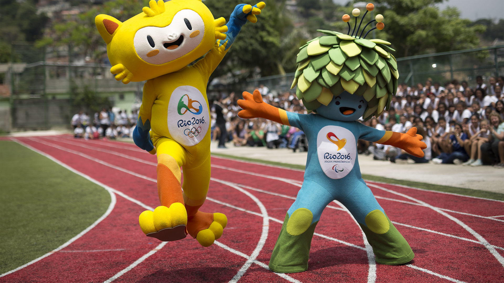
Rio2016 Paralympic Games Brand
@ Tátil Design de Ideias
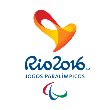
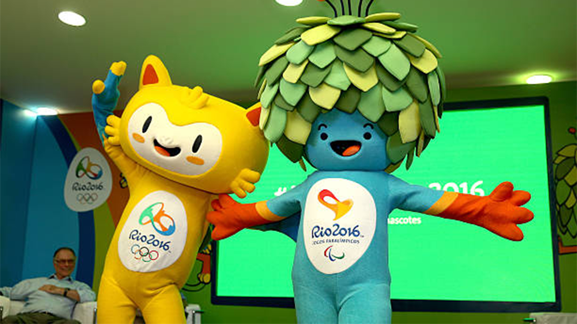
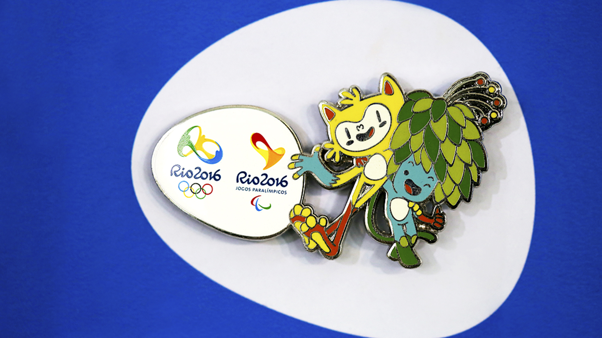
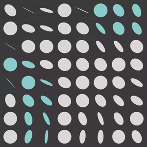
Following the win in 2010 of the Rio 2016 Olympic Games™ pitch, Tátil was invited to design the Rio 2016 Paralympic Games™ brand. Our challenge was to extend the three-dimensional concept to a brand that expressed Passion and Transformation while also conveying the values behind the Paralympic Movement – courage, determination, inspiration and equality – and materializing its motto: “Spirit in Motion.”
We started with a deep dive investigation into the Paralympic universe in order to design the strategic tools that would guide the project. We spoke to athletes, their families, teammates, and noticed that above all else the energy they had when describing their life stories was infectious and inspiring; a powerful insight into their unparalleled ability to overcome barriers, the spark for the first creative ideas. Instead of focusing on performance, we aimed for a symbol that conveyed their relentless energy, that was immediately relatable, intuitive and inspiring. An emblem that combined universal codes with positive associations, thus celebrating the principles of universal design.
The Rio 2016™ Paralympic Games brand is the emblem for the contagious energy of this transforming event, and its spiral form thrills and inspires. It is a three-dimensional representation of the determination intrinsic to the Paralympic spirit. A heart that beats with infinite energy, that makes us even more human and that brings us all closer together, reinforcing the notion that on the inside we are all equal.
A multisensory brand, with shapes, sounds and textures that together enable any athlete or person to experience it.
Unanimously approved by the Judging Committee, the Paralympic Games brand triggers powerful connections with athletes and people when it is experienced. In 2016, not only will the brand visually feature in products and campaigns promoting the event, it will also be broadcasted to the world.
++ TATIL DESIGN DE IDEIAS
CEO
Fred Gelli
Planning
Roberta Gamboa; Tania Savaget;
Luiz Arruda; Mario Rosa; Marina Mendes
Creative Team
Fernanda Saboia; Felipe Aguiar; Roberta Gamboa; Ana Cunha; Daniel Souza; Leonardo Lopes; Mariana Hermeto; Samara Araújo; Bruna Carbonesi; Camila Dias; Carol Peixoto; Diego Fonseca; Eduardo Paixão; Fabio Gaspar; Ilana Bandarovsky; Jana Glatt; João Faraco; Laura Sugimoto; Luis Fernando Costa; Mariana Leal; Mila Daffre; Milton Von Seehausen; Rodrigo Bessa; Rodrigo Maia; Tasso Canedo; Thiago Holzmeister; Anderson Marcicano; Marcelo Lopes; Marcus Dietrich; Tania Belarmino
Account Management
Roberto Trinas; Mariana Soccodato; Barbara Martinho
Awards
. iF Design
. Brasil Design Week
. Idea Brasil
. Wave Festival
. Brazilian Graphic Design Biennial


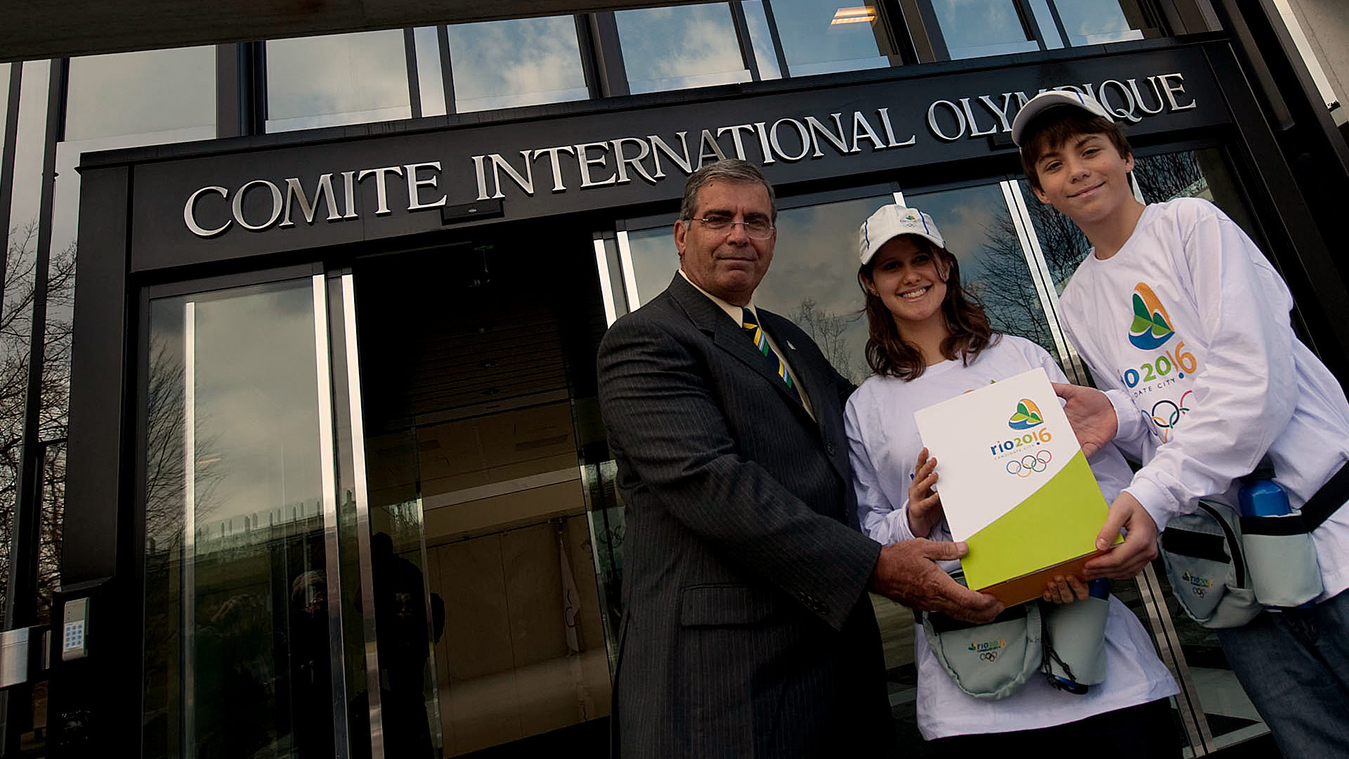
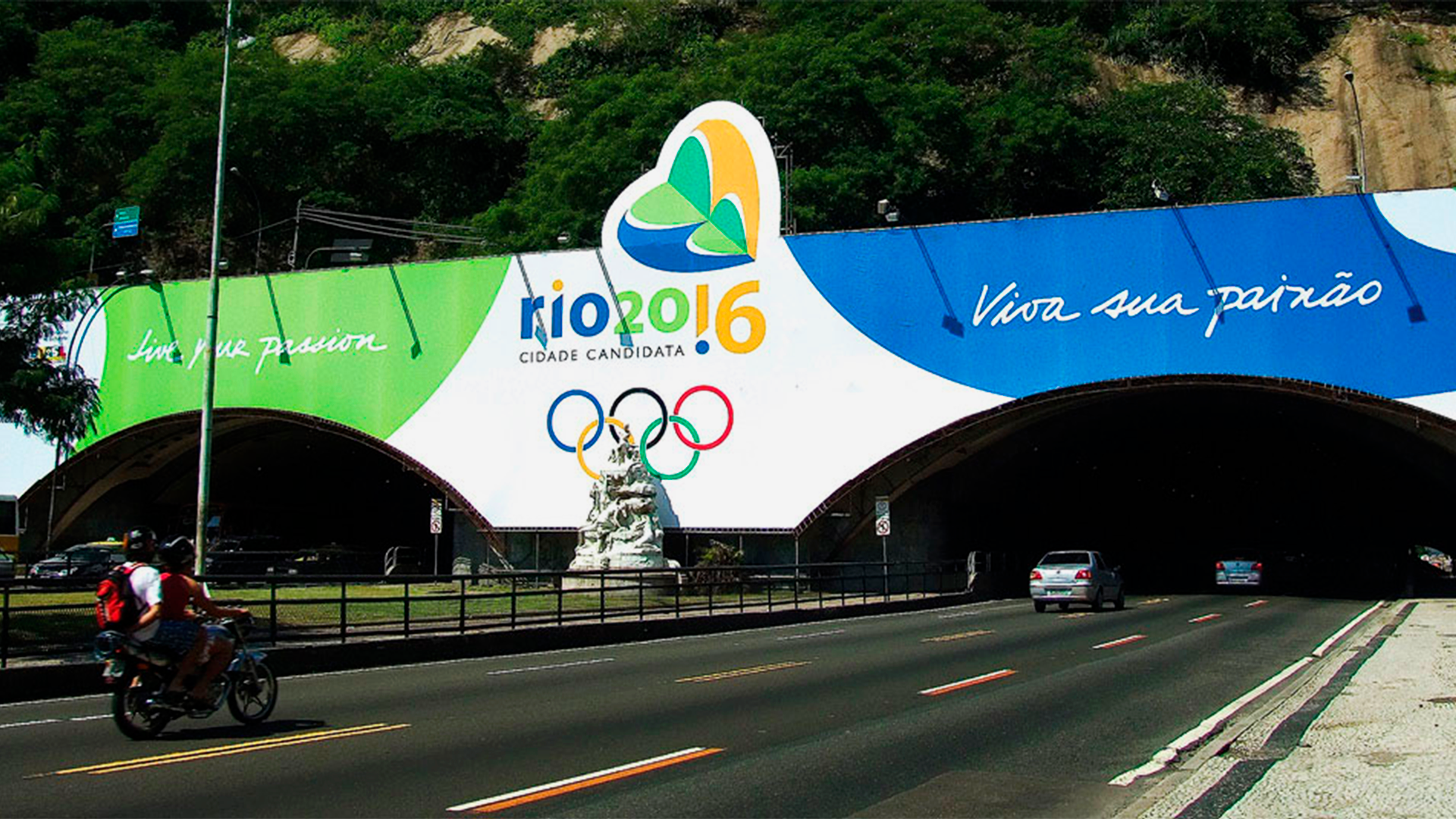
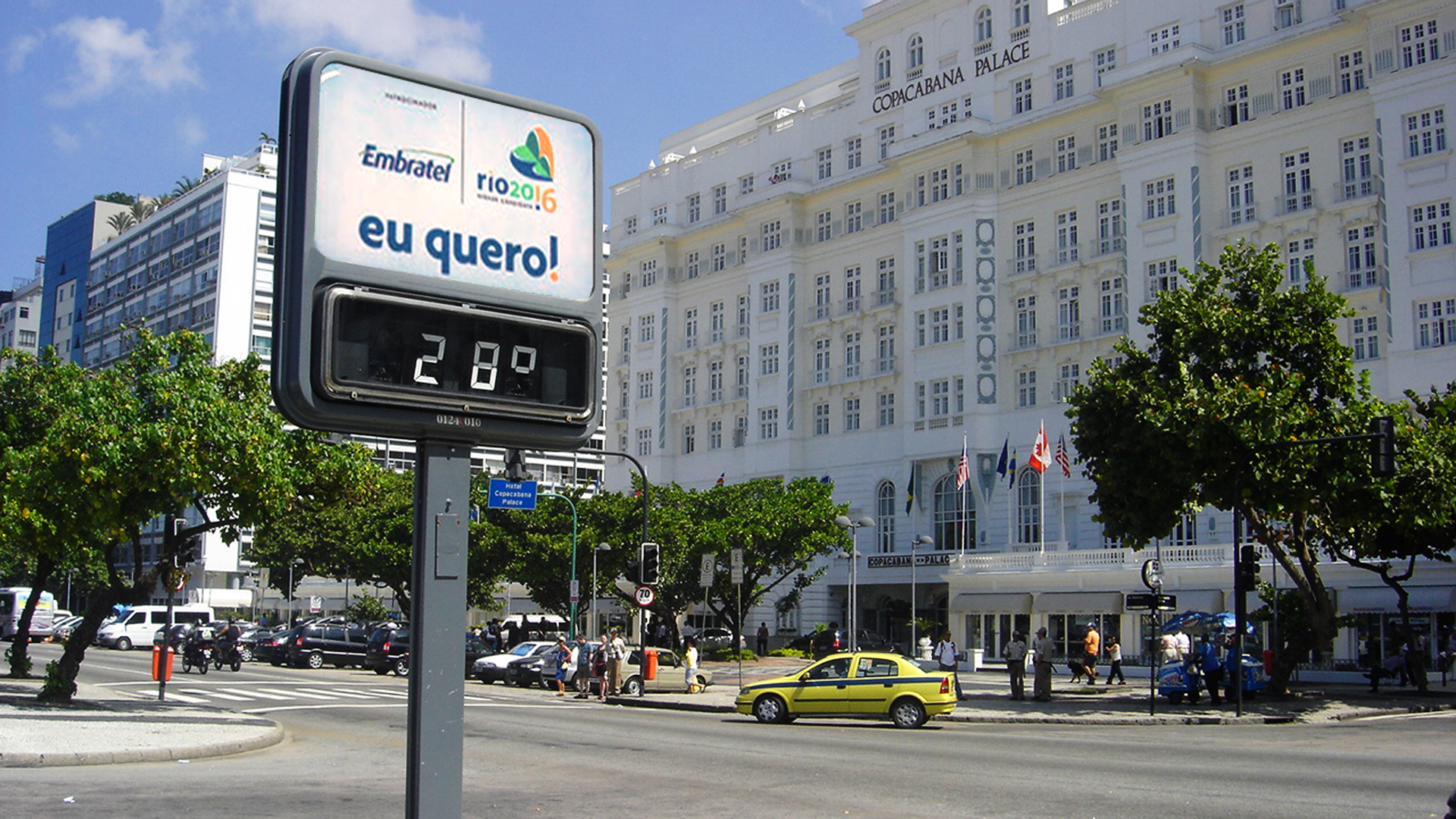
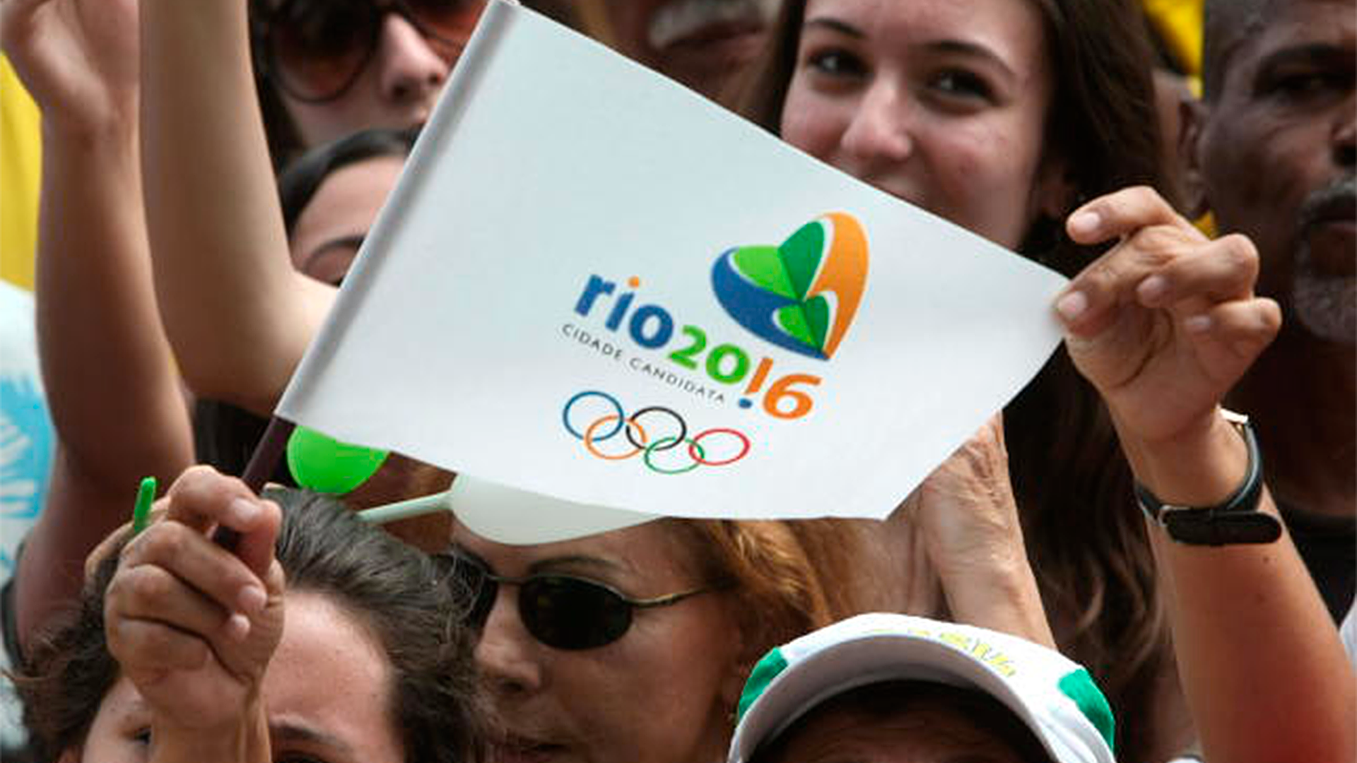
Rio2016 Candidate City Brand
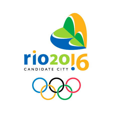
@ Soter DesignFollowing the success of the South American Games (2002) and the Pan American Games (2007), the Brazilian Olympic Committee (BOC) realized that the time had come to go further and present Brazil's candidacy to host the Summer Olympics. It was a bold proposal to bring an event
of such magnitude for the first time to a South American country, but the BOC was relying on the knowledge gathered through the two previous events.
A technical analysis commissioned by BOC Executive Council pointed Rio de Janeiro as the most prepared city to receive the event due to the Pan American Games legacy. The challenge then was to put together in one brand the concept that led the campaign: to show the world that Brazilians are a passionate for sports and that Rio de Janeiro was the perfect stage to live and show this passion.
Revisiting one of the biggest city icons, we transformed its contours and its reflection in the waters of Guanabara Bay in a heart, symbol of passion. We brought vibrant tones to the colors of brazilian flag that reflected the joy of our people and the celebration of sports. The result is a simple, strong and flexible brand that stands for the enthusiastic spirit of the Brazilians to receive the Olympic Games.
The brand and its visual identity system were used in all technical material of the candidacy (dossiers, reports, maps, etc.) and also throughout the campaign that took the city until the official announcement that Rio would host the 31st edition of the Summer Olympics, made by the president of the International Olympic Committee, Jacques Rogge, on October 2nd 2009 during the 121st Session of the International Olympic Committee in Copenhagen.
++ SOTER DESIGN
CEO
Ana Soter
Creative Team
Daniel Souza; Gabriela Morand; Juliana Lins; Larissa Mayer; Luise Krause; Luiza Aché; Gilmar Padrão; Jackie Torterolli
CEO
Ana Soter
Creative Team
Daniel Souza; Gabriela Morand; Juliana Lins; Larissa Mayer; Luise Krause; Luiza Aché; Gilmar Padrão; Jackie Torterolli


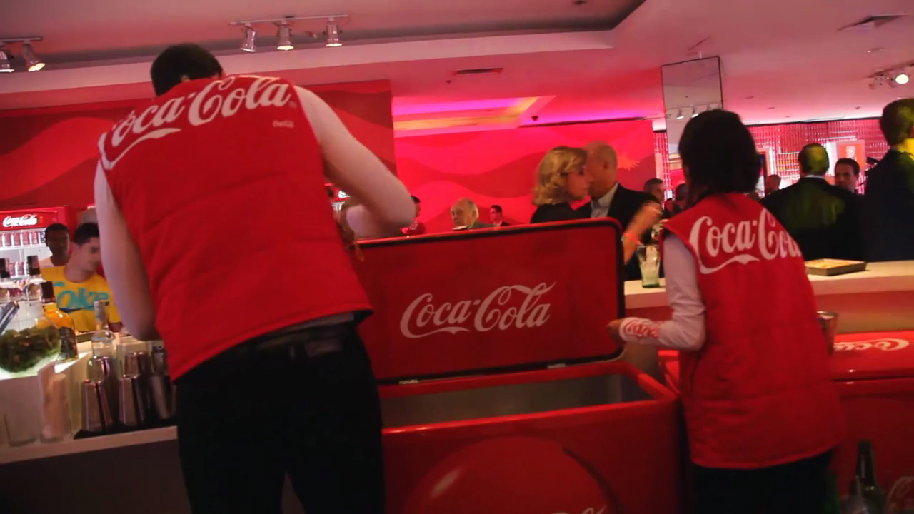
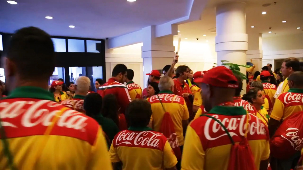
Coca-Cola Rio2016 VIS
@ Tátil Design de Ideias
During the Rio de Janeiro 2016 Olympic Games Coca-Cola presented what would be its permanent signature for this and future games editions. Under the company’s Active Healthy Living communication platform, the signature should regard brand’s design principles and, more than anything, express the concept of movement.
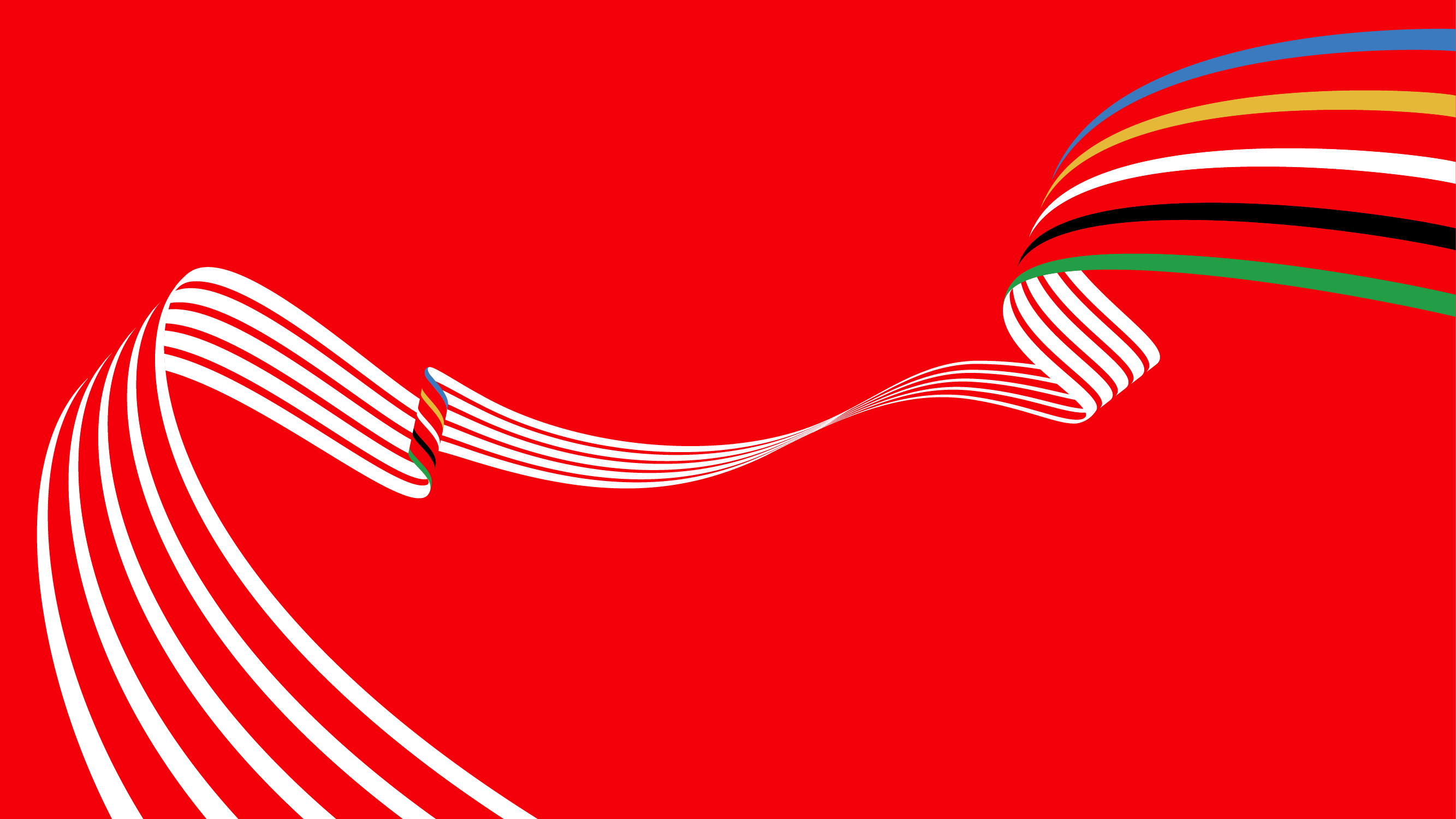
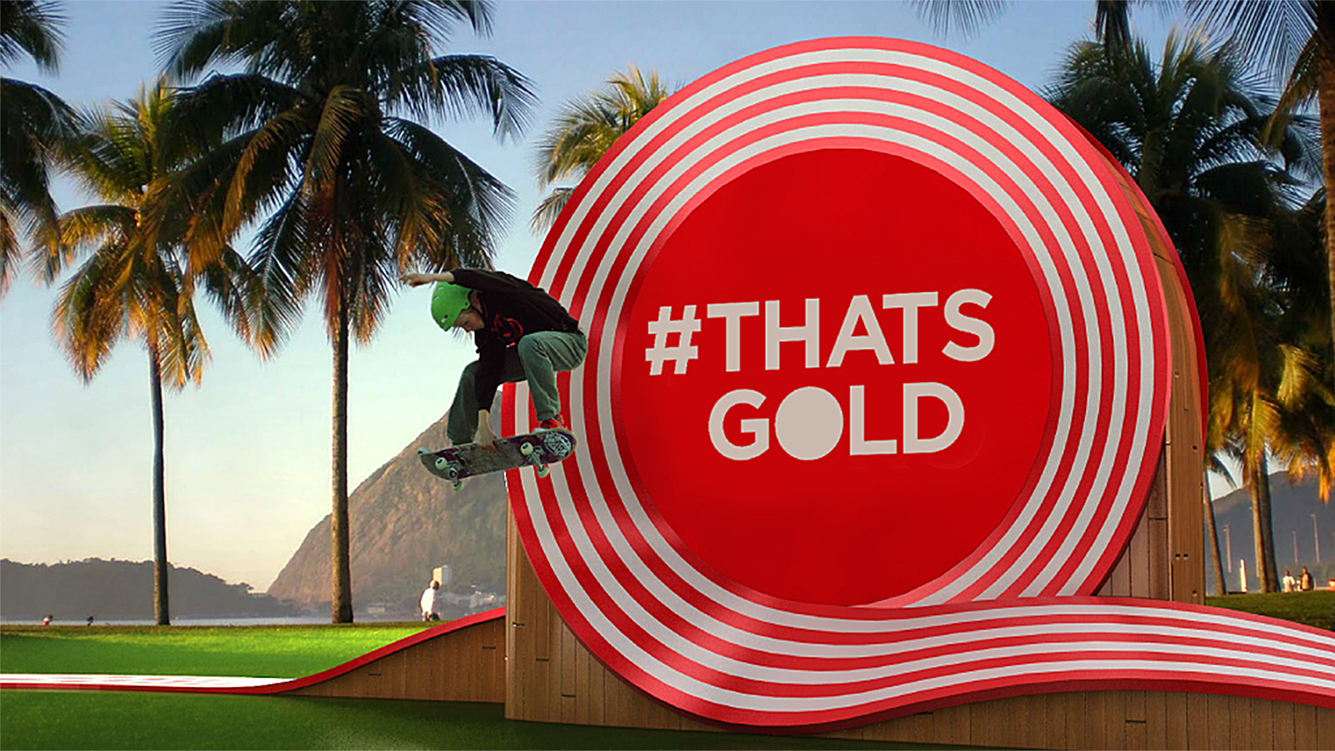
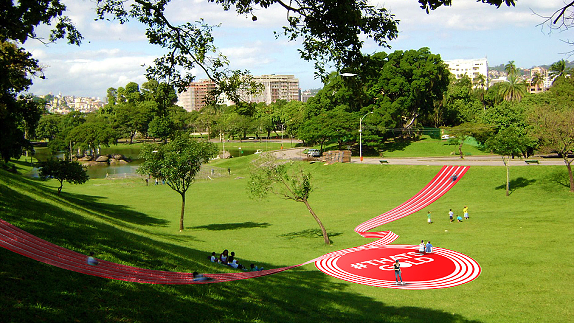
In order to unite Coca-Cola, the concept of movement and Olympic Games in a unique and memorable way, the starting point were the two most iconic visual assets of the brand: Contour bottle and Dynamic Ribbon. Contour inspired the brand; the Dynamic Ribbon, the identity. From each of them stem the lines that form lanes, that embrace the Olympic sports, and that celebrate the Games in an endless, contagious infinite movement.
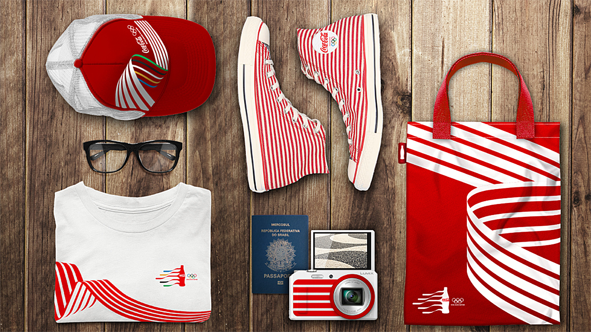
Beyond a powerful, impactful and unique brand, the result is a flexible identity system that responds to multiple touch points and enables for infinite forms of applications: ranging from print, to urban interventions, to conventional communication materials to environment design. All this is the result of a unique partnership between the teams of Tátil Design de Ideias, Cravo Ofício and the global Coca-Cola design team.
In order to unite Coca-Cola, the concept of movement and Olympic Games in a unique and memorable way, the starting point were the two most iconic visual assets of the brand: Contour bottle and Dynamic Ribbon. Contour inspired the brand; the Dynamic Ribbon, the identity. From each of them stem the lines that form lanes, that embrace the Olympic sports, and that celebrate the Games in an endless, contagious infinite movement.
Beyond a powerful, impactful and unique brand, the result is a flexible identity system that responds to multiple touch points and enables for infinite forms of applications: ranging from print, to urban interventions, to conventional communication materials to environment design. All this is the result of a unique partnership between the teams of Tátil Design de Ideias, Cravo Ofício and the global Coca-Cola design team.
++ TATIL DESIGN DE IDEIAS
CEO
Fred Gelli
Creative Team
Felipe Aguiar; Roberta Gamboa; Ricardo Bezerra; Ana Cunha; Daniel Souza; Leonardo Lopes; Marcelo Damn; Rodrigo Bessa
Account Management Mariana Soccodato
++ CRAVO OFÍCIO
Planning
Vivian Mayrink
Creative Team Lilian Racco; Patrícia Clarkson; Carol Peixoto; Rodrigo Borges
Account Management Eduarda Paternot
++ COCA-COLA DESIGN TEAM James Sommerville; Raphael Abreu; Cris Grether


Tátil Design de Ideias & Cravo Ofício © 2016.


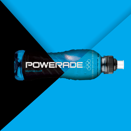
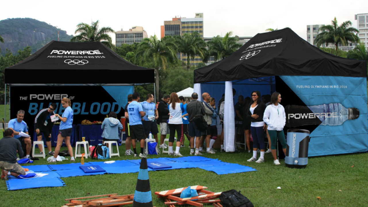
Powerade Rio2016 VIS
@ Tátil Design de Ideias
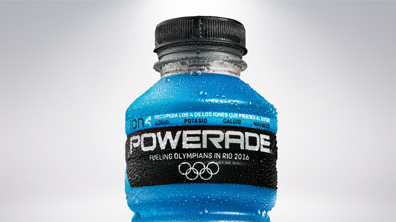
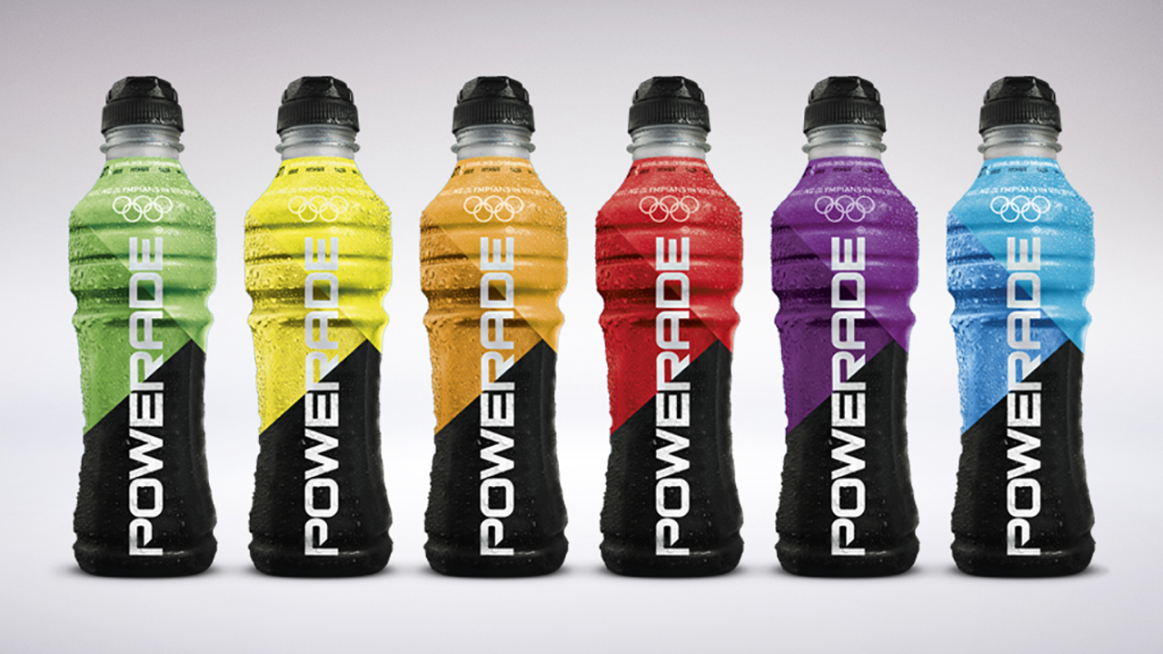
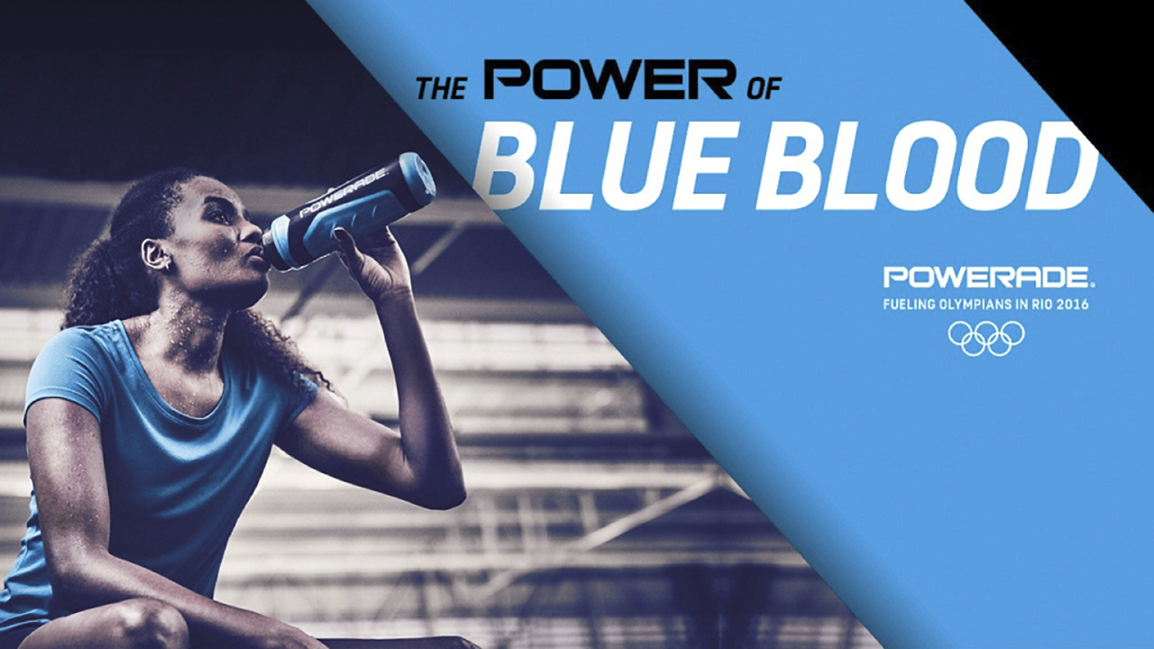
Powerade, the official sports drink of the Rio 2016 Olympic Games™, wanted to establish a relevant and unique presence in the world’s most iconic event for high-performance and the transcending of limits. Together with the Coca-Cola Global Design team, Tátil embraced the challenge to create the brand’s Olympic VIS with the aim of strengthening its identity and equity.
We decided to place the brand at the center of the visual identity to convey the qualities of ‘transcending limits’ and ‘high-performance’ in a powerful, impactful and unique manner. From the letter R in Powerade, stems an expressive diagonal line that then extends into a multitude of layers, creating planes and spreading across space in a dynamic way. Expanding planes that represent the ability to ‘transcend limits’ and to ‘push further’, inspire compositions in which the brand, product, or athletes become the heroes of the visual identity.
We decided to place the brand at the center of the visual identity to convey the qualities of ‘transcending limits’ and ‘high-performance’ in a powerful, impactful and unique manner. From the letter R in Powerade, stems an expressive diagonal line that then extends into a multitude of layers, creating planes and spreading across space in a dynamic way. Expanding planes that represent the ability to ‘transcend limits’ and to ‘push further’, inspire compositions in which the brand, product, or athletes become the heroes of the visual identity.
++ TATIL DESIGN DE IDEIAS
CEO
Fred Gelli
Creative Team
Felipe Aguiar, Ricardo Bezerra, Roberta Gamboa, Ana Cunha; Daniel Souza, Rodrigo Bessa
Account Management
Mariana Soccodato
++ COCA-COLA DESIGN TEAM James Sommerville; Raphael Abreu; Cris Grether
CEO
Fred Gelli
Creative Team
Felipe Aguiar, Ricardo Bezerra, Roberta Gamboa, Ana Cunha; Daniel Souza, Rodrigo Bessa
Account Management
Mariana Soccodato
++ COCA-COLA DESIGN TEAM James Sommerville; Raphael Abreu; Cris Grether


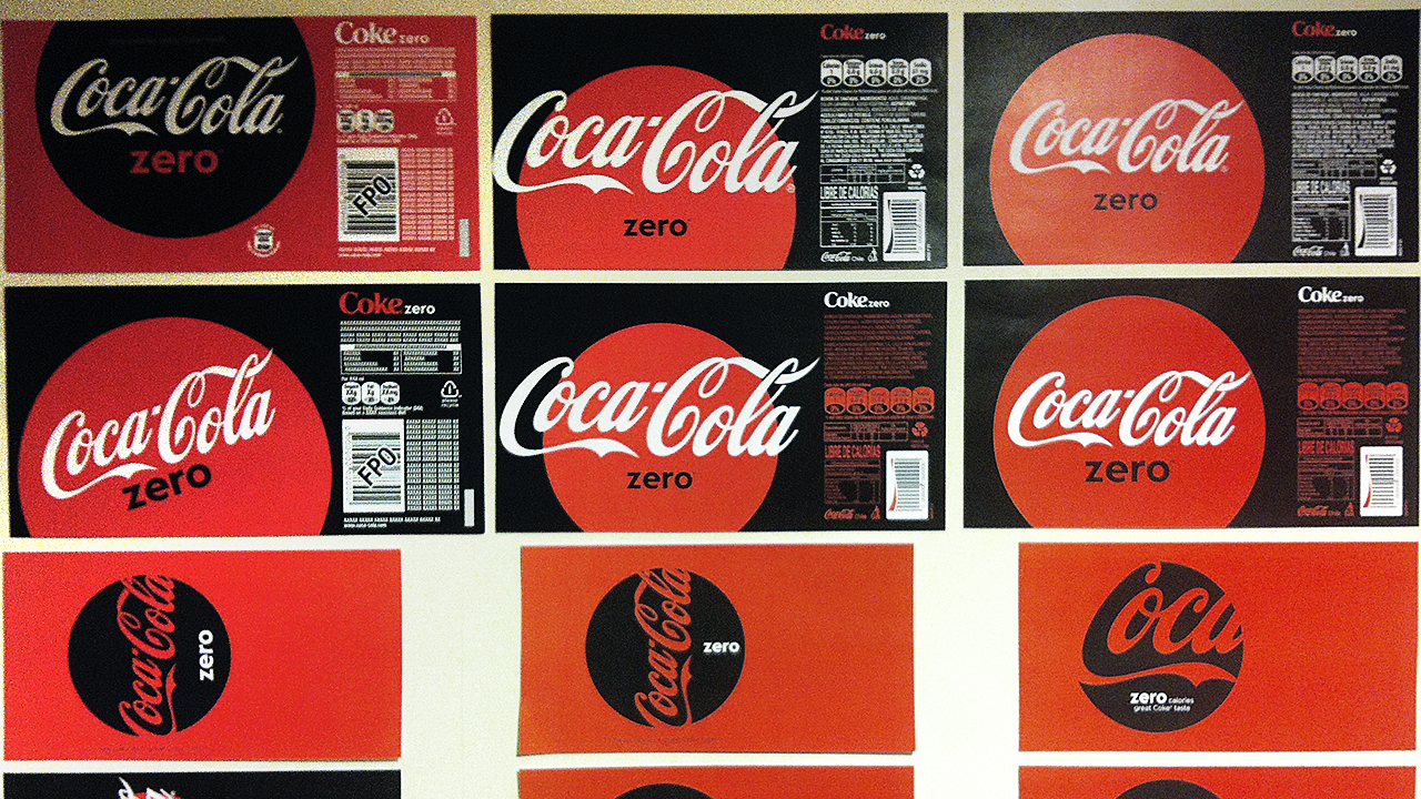
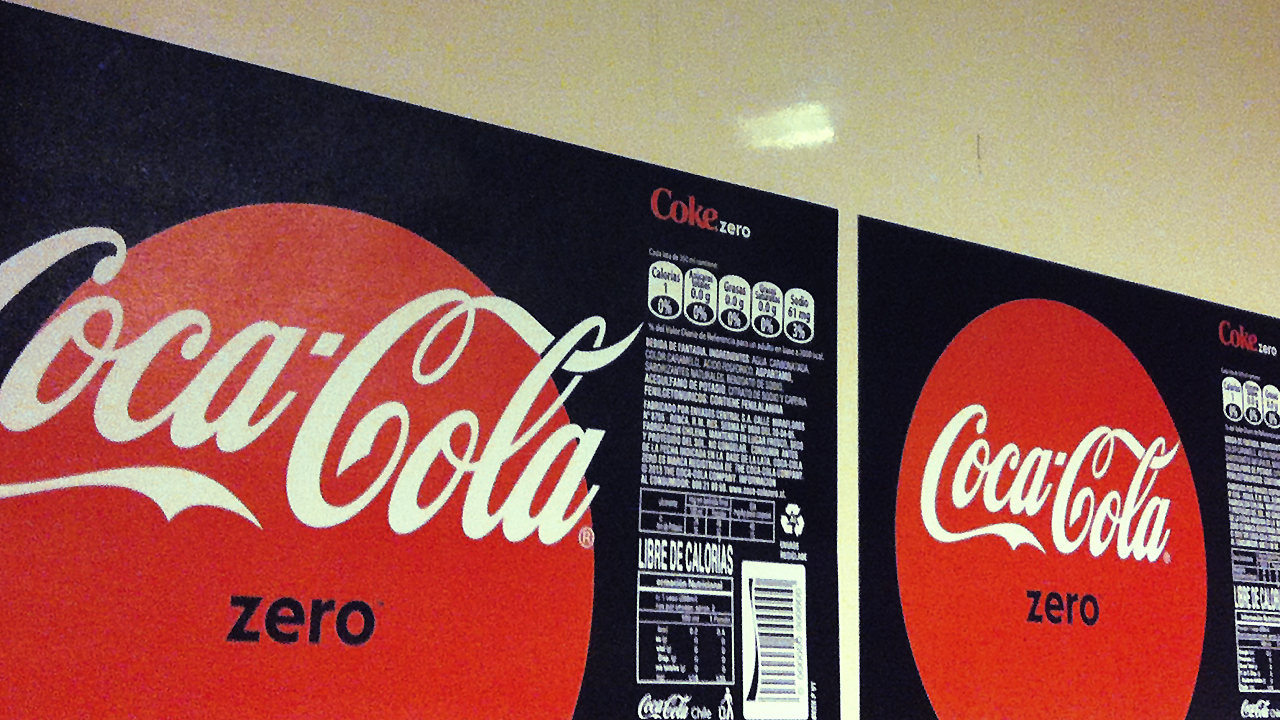
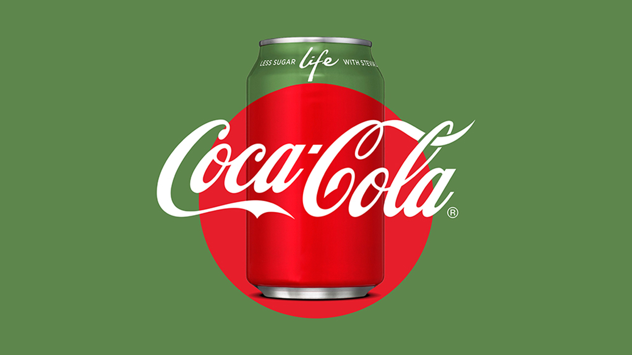
Coca-Cola One Brand
@ Tátil Design de Ideias
Designing the new packaging for one the world’s most iconic brands is in itself a big deal. But this time, the challenge we shared with five other international agencies (BVD, SDL, Moniker, Hey Studio and United Design) as well as the Coca-Cola Global Design team, had an extra spark: how to unify multiple brands through design. We needed to develop a single identity system that visually integrated all packaging variants (Coca-Cola Classic, Coca-Cola Diet, Coca-Cola Zero Sugar and Coca-Cola Life) and that conveyed across all products a single promise, a single refreshment, a single Coca-Cola.
Throughout the design process we identified the classic, emblematic, iconic ‘Red Disc’ as the element capable of visually unifying all packaging variants. The ‘Red Disc’ was first introduced in 1930 and since then it has always been part of the Coca-Cola history, truly encapsulating the brand’s essence.
Hundreds of sketches, inspirations, possibilities and ideas were explored in a collaborative journey leading us to our final destination: a modular system that can be applied across all global forms of packaging and which builds a single Coca-Cola: authentic, refreshing, uplifting; the power of red.
For the first time in 130 years the packaging uses an unexpected yet contemporary way of refreshing the classic ‘Red Disc’ whilst at the same instilling the Coca-Cola signature across all products in a prominent way.
++ TATIL DESIGN DE IDEIAS
CEO
Fred Gelli
Creative Team
Ricardo Bezerra, Cecilia Costa, Daniel Souza, Ilana Bandarovsky, Mariana Hermeto, Renan Benvenuti, Bruna Aragão, Fabrizzio Nascimento
Account Management Mariana Soccodato, Camila Rodrigues
++ COCA-COLA DESIGN TEAM James Sommerville; Raphael Abreu; Cris Grether
Project designed in partnership with BVD, SDL, Moniker, Hey Studio and United Design
Awards . Brazilian Graphic Design Biennial


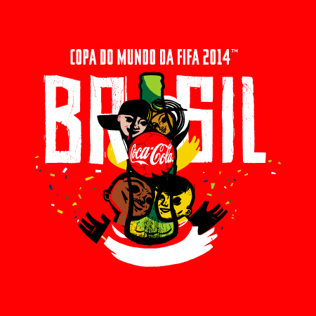
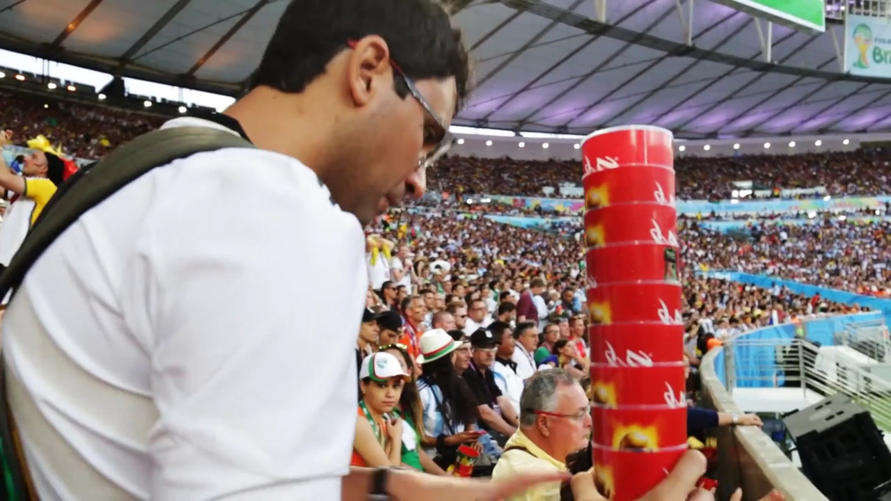
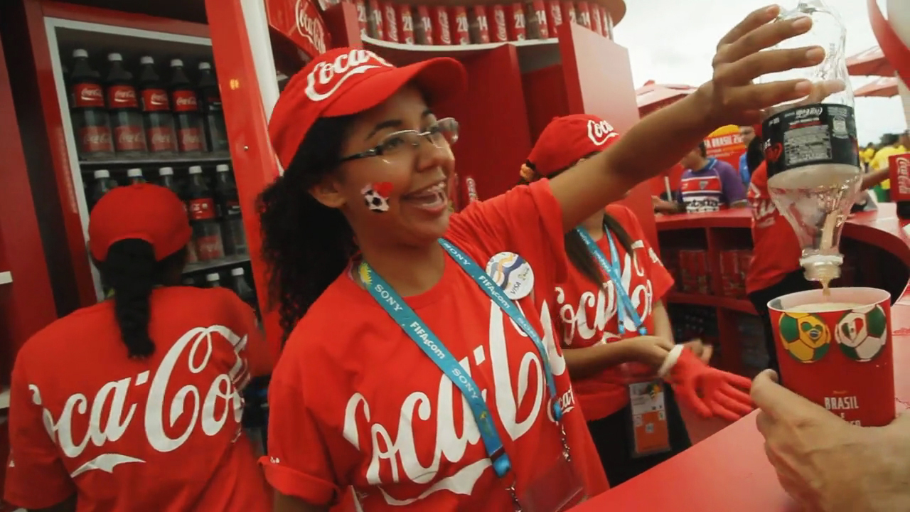
Coca-Cola FWC 2014 (VIS Rollout)
@ Tátil Design de Ideias
On 2014 FIFA™ World Cup, the most awaited event of all the time by the Brazilians, Coca-Cola had a great challenge: how to communicate this important moment that is full of expectations. One year before the World Cup in a warm moment, Coca-Cola began presenting the communication to its consumers: this was not the FIFA™ World Cup of a nation or one player. That was the FIFA™ World Cup of everyone.
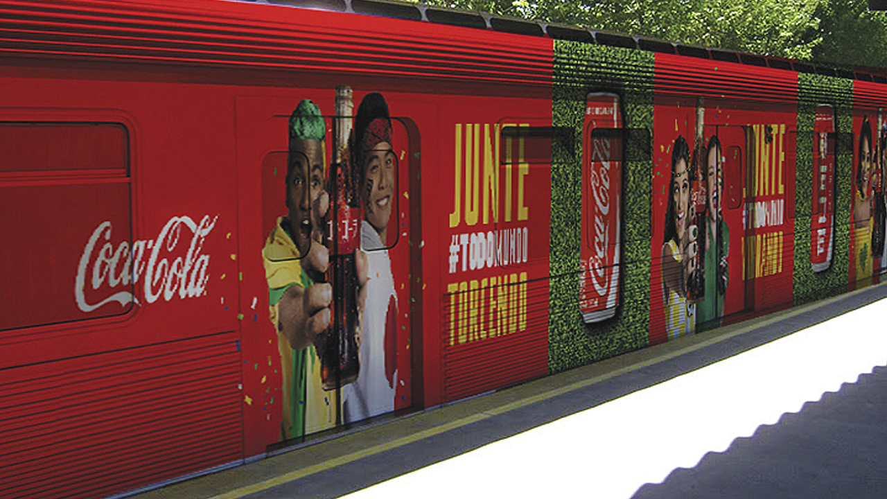
Tatil, as a Coca-Cola partner, accepted the challenge and sought solutions to this grand project. Using as a principal component the Coca-Cola brand and the VIS of 2014 FIFA™ World Cup, taking the concept to all points of contact with the consumers, packing, point of purchase and OOH media (out of home). All on an integrated way, bringing unity and consistency for the communication.
Tatil, as a Coca-Cola partner, accepted the challenge and sought solutions to this grand project. Using as a principal component the Coca-Cola brand and the VIS of 2014 FIFA™ World Cup, taking the concept to all points of contact with the consumers, packing, point of purchase and OOH media (out of home). All on an integrated way, bringing unity and consistency for the communication.


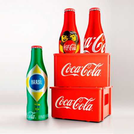
Coca-Cola 2014 Mini Bottles
@ Tátil Design de Ideias
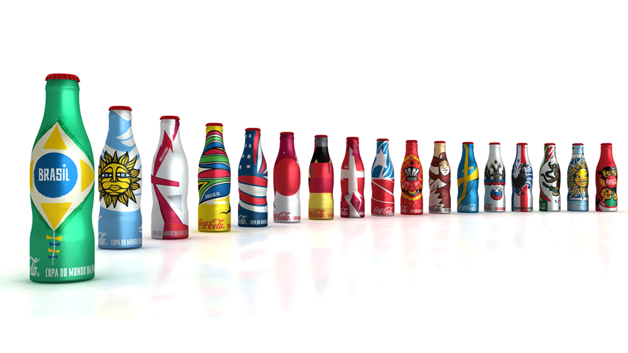
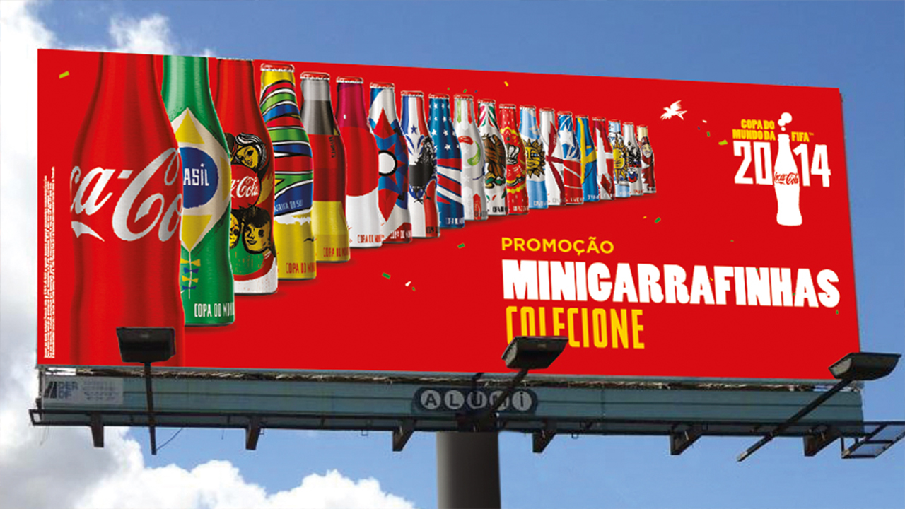
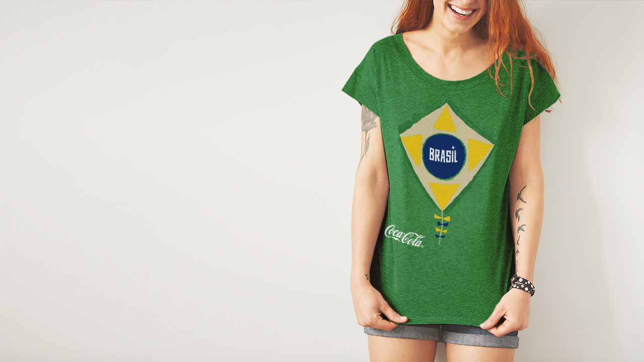
Do you remember those mini Coca-Cola bottles that created a real hype in the 80’s? They are back! Coca-Cola wanted to treat its consumers with a memorable gift for the FIFA World Cup 2014™ and Tátil’s challenge was to reinvent the mini-bottles that once captivated an entire generation. To hit the mark, new illustrations had to be created for the mini-bottle collection to ensure that this would be the most memorable promotional gift of the event.
Tátil turned to an art-inspired solution and we partnered with Speto, – the artist behind Coca-Cola’s VIS for the FIFA World Cup 2014 ™ – who then curated other Brazilian illustrators known for their young and contemporary artistic language.
We selected four artists, as well as Speto himself, to illustrate the 18 host-countries. Through a collaborative creative process, we cross-examined the cultural similarities between each country and each artist’s techniques to work out the perfect-match to represent each country. We then created the visual identity of the “Mini-Bottles from Around the World” campaign, which was based on a collectables theme, and rolled it out across various touch points, including: OOH, the fleet, and PoS.
Like in the 80’s, the new mini-bottles became an instant success and flew out the shelves; in just a little over a month of promotion they were out-of-stock nation-wide. An unforgettable project that defined yet another generation.
++ TATIL DESIGN DE IDEIAS
CEO
Fred Gelli
Creative Team
Felipe Aguiar; Ricardo Bezerra; Ana Cunha; Daniel Souza; Leonardo Lopes; Cae Silva; Eduardo Paixão; Clara Silva
Account Management
Mariana Soccodato
CEO
Fred Gelli
Creative Team
Felipe Aguiar; Ricardo Bezerra; Ana Cunha; Daniel Souza; Leonardo Lopes; Cae Silva; Eduardo Paixão; Clara Silva
Account Management
Mariana Soccodato


Video produced by JWT.
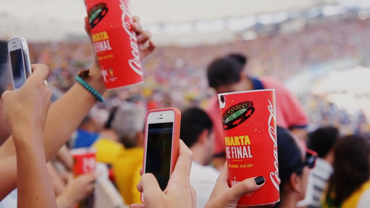
Coca-Cola FCC 2013 VIS
@ Tátil Design de Ideias
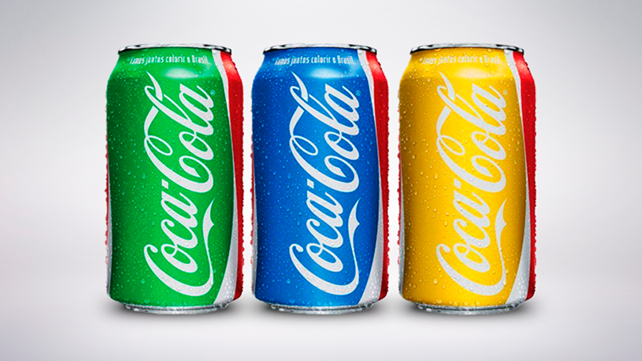
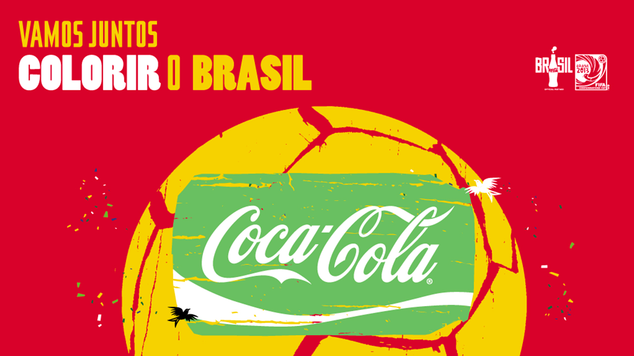
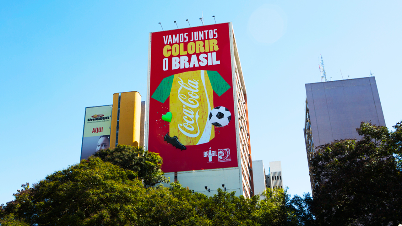
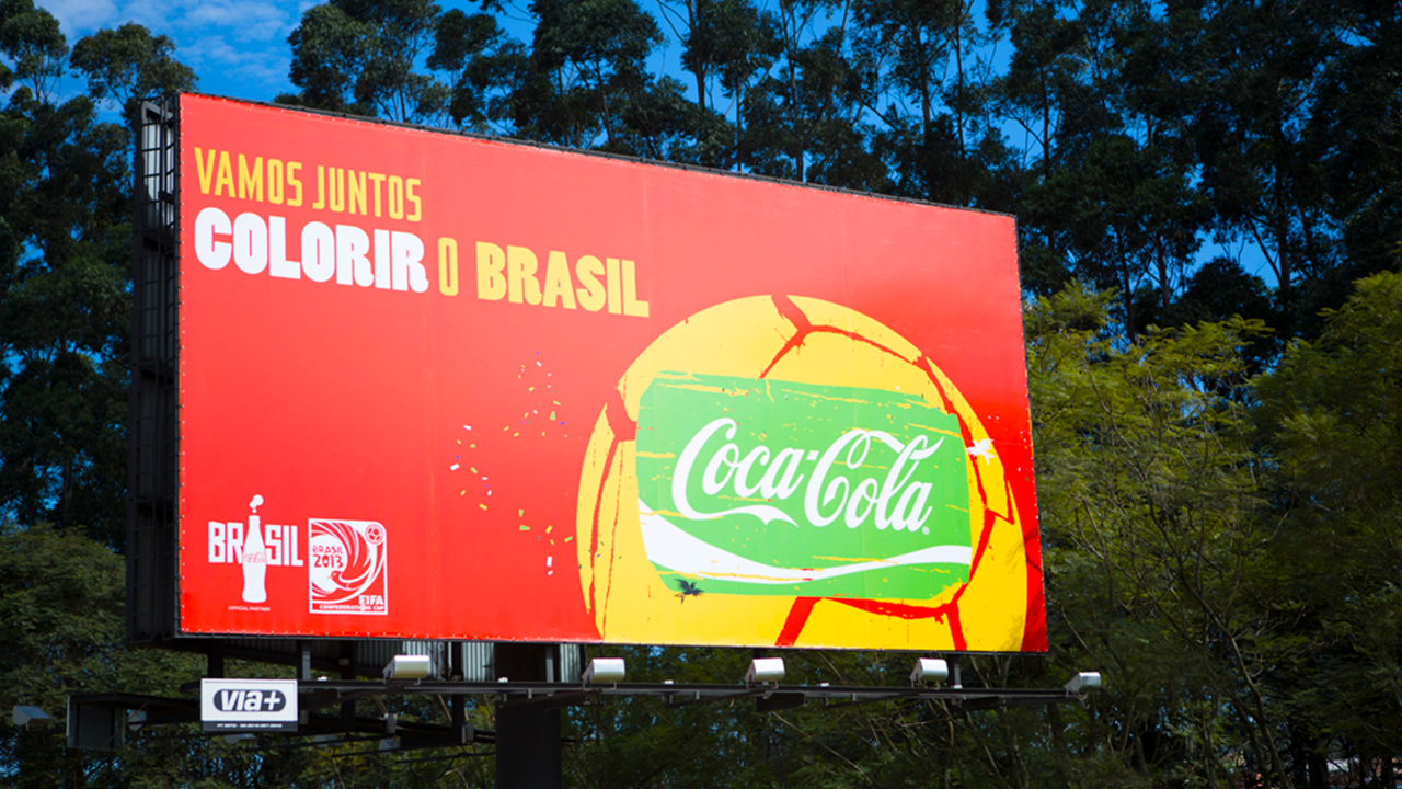
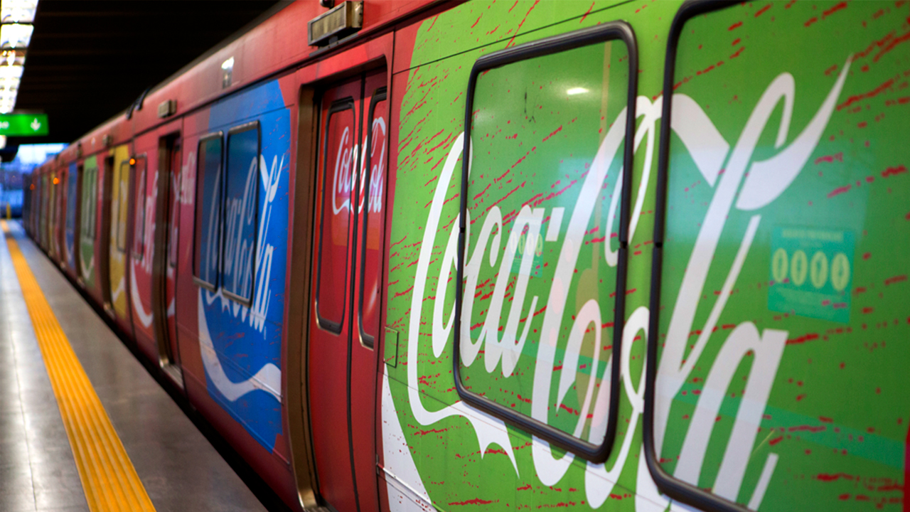
As the official sponsor for both the FIFA Confederations Cup 2013™ and the 2014 FIFA World Cup™, Coca-Cola had the goal of increasing its brand presence during these two major events. Starting with the Confederations Cup, a graphic identity was needed to materialize the “Together let’s color Brazil” campaign in an inspiring way. It was a moment in which the entire nation was getting ready and preparing to host guests from all over the world.
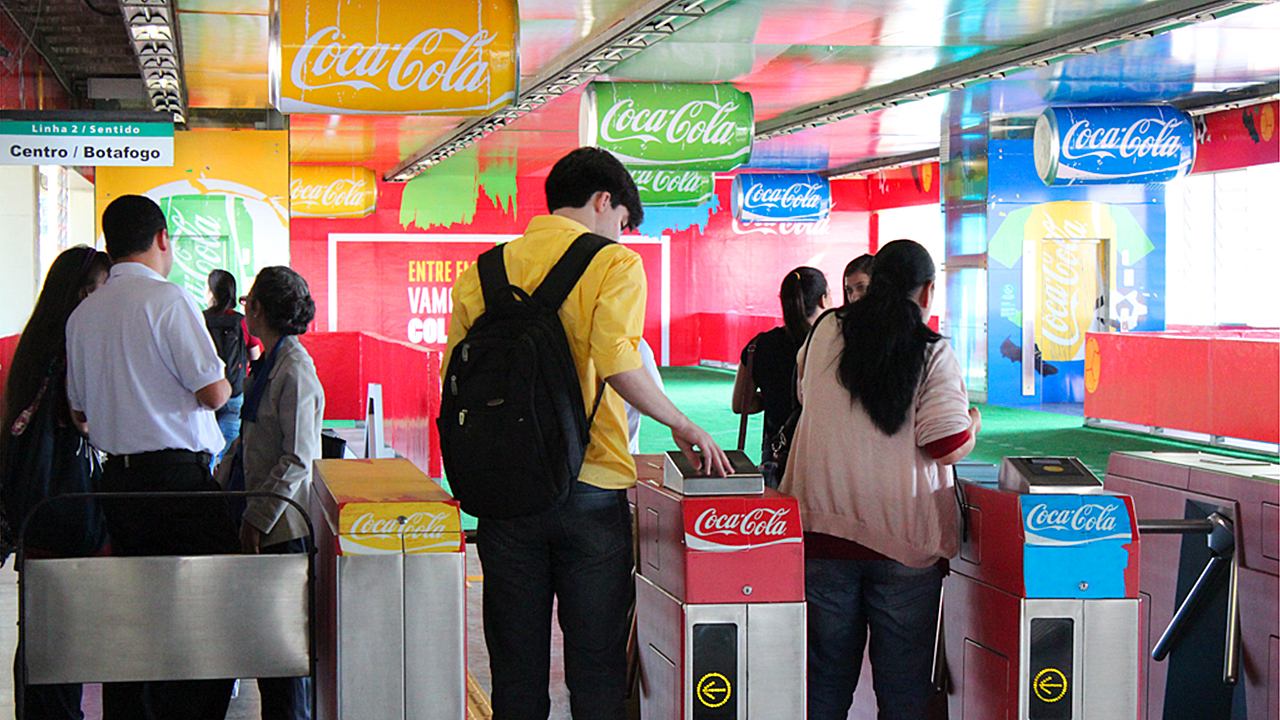
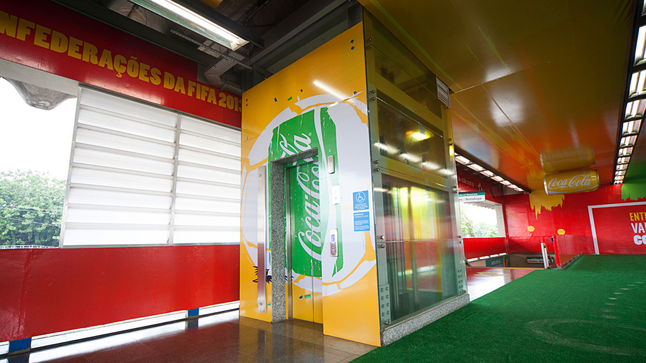
We translated the concept across varying fronts. First, we colored Coca-Cola’s most iconic asset: the can. Then, using the ‘World’s Cup’ VIS as foundation, we developed a new visual identity and applied it across a range of outdoor advertising. Finally, we created special OOH interventions including the Tom Jobim International Airport’s baggage claim terminal and the Maracanã Station. The combination of all these applications materialized the formal invitation to the public: “Together let’s color Brazil?”.
Through a set of creative and unique expressions – that were visually aligned with the communications created for both the Confederations Cup and the “World’s Cup” VIS campaign – the project dressed the city and ensured impactful visibility as well strong brand presence for the Coca-Cola brand, the official sponsor of two of the most important events of 2014.
++ TATIL DESIGN DE IDEIAS
CEO
Fred Gelli
Creative Team
Felipe Aguiar; Ricardo Bezerra; Ana Cunha; Daniel Souza; Leonardo Lopes; Samara Araujo; Cae Silva; Eduardo Paixão; Clara Silva
Account Management
Mariana Soccodato
CEO
Fred Gelli
Creative Team
Felipe Aguiar; Ricardo Bezerra; Ana Cunha; Daniel Souza; Leonardo Lopes; Samara Araujo; Cae Silva; Eduardo Paixão; Clara Silva
Account Management
Mariana Soccodato


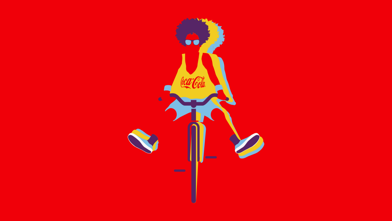
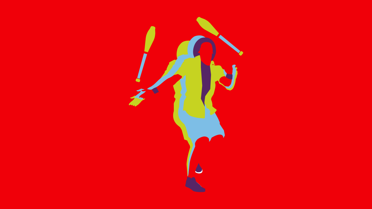
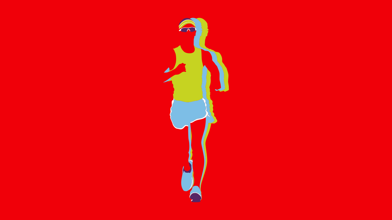
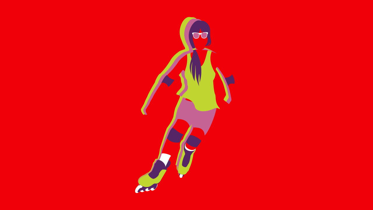
Coca-Cola AHL VIS
@ Tátil Design de Ideias
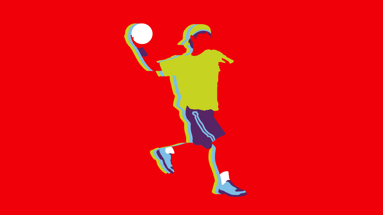
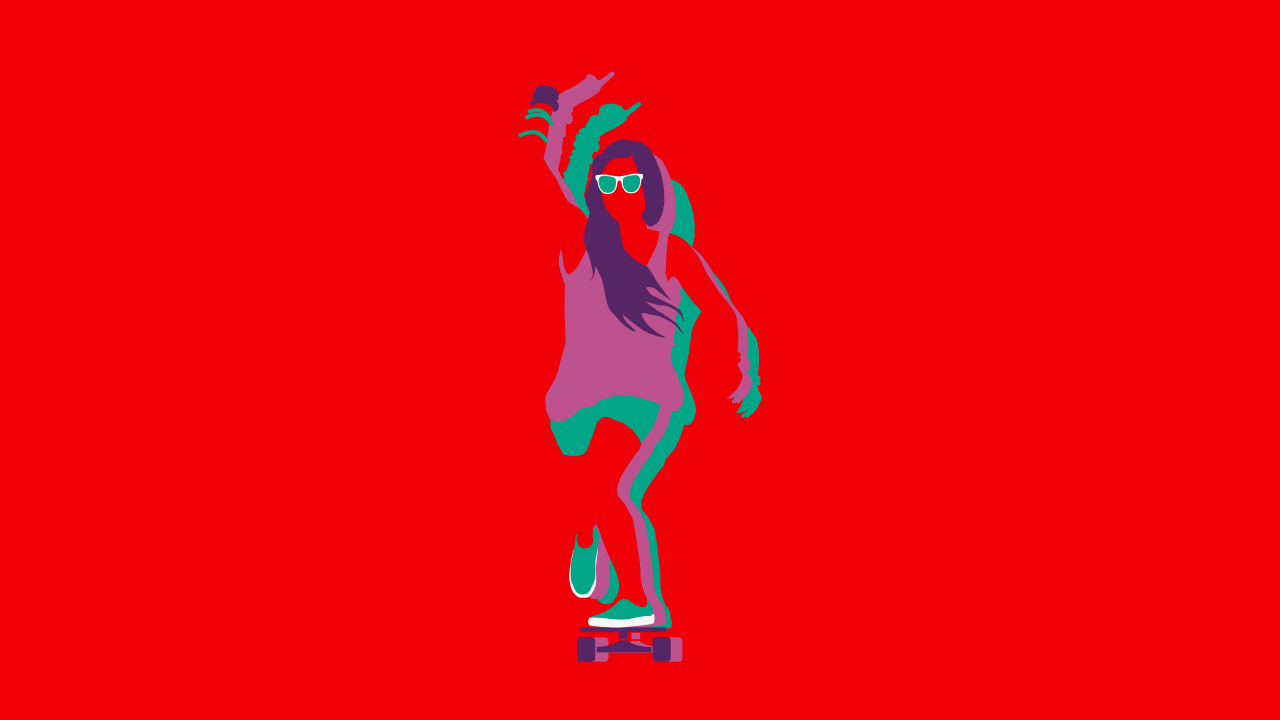
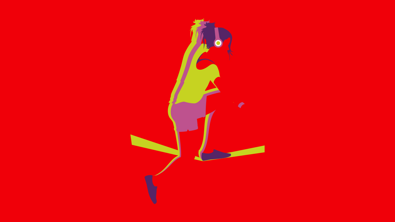
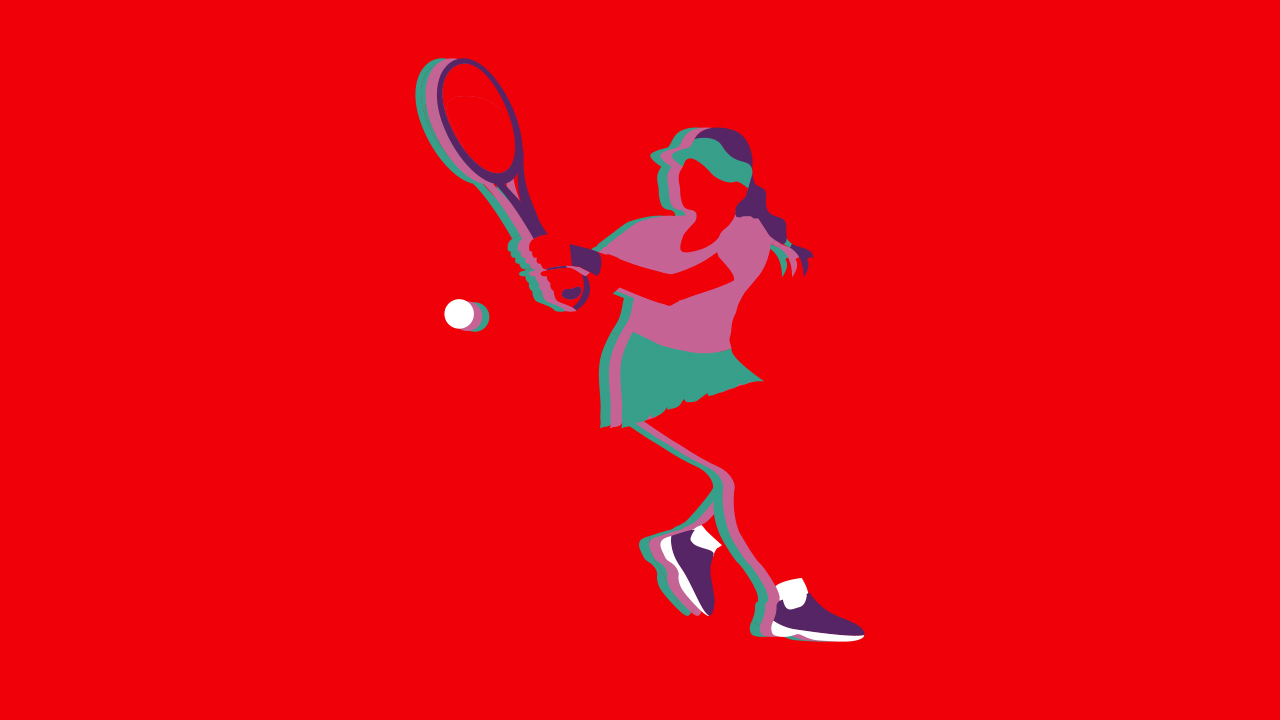
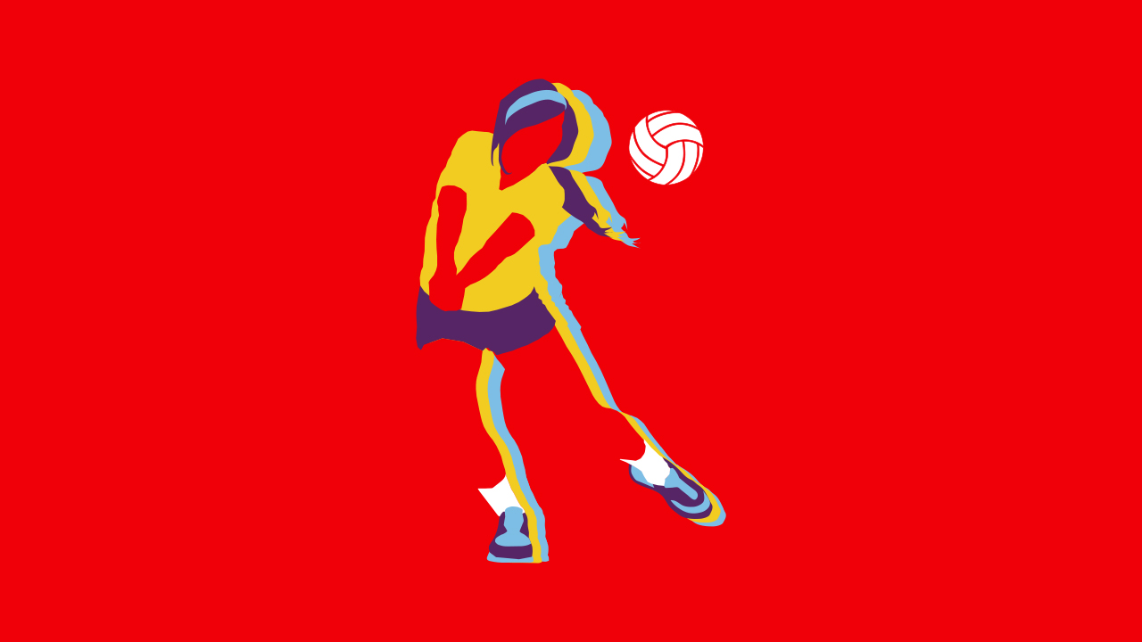
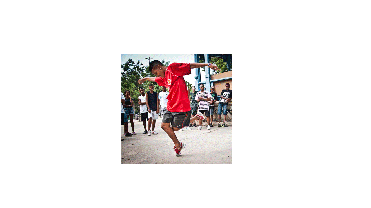
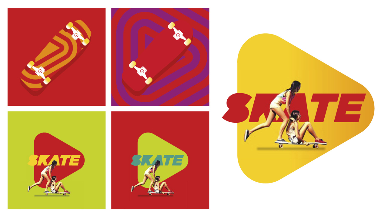
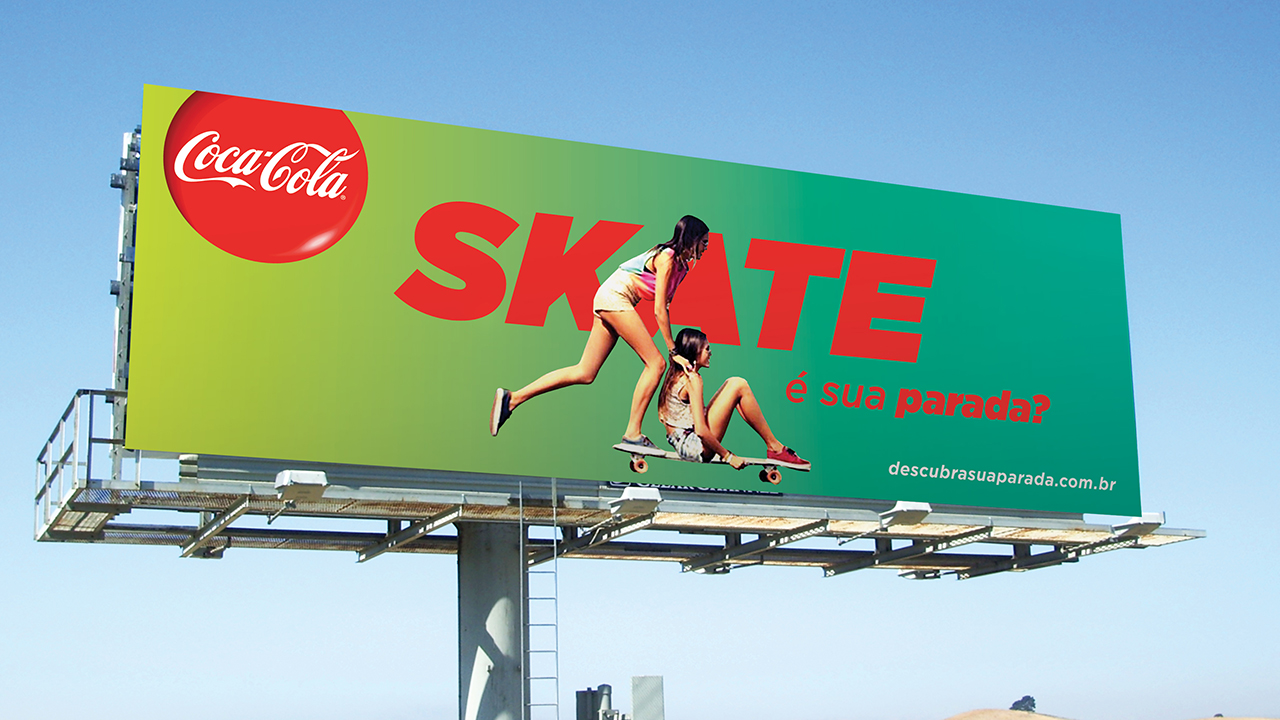
Coca-Cola wants to help young people to have a more active lifestyle and believes the teenager is stopped is because they have not found a physical activity that makes you happy. To From this insight, the Tatil was invited to build a visual language that connects with teens, helping them develop a healthier lifestyle and in turn, a happier life.
The solution found by Tatil emerged from a meeting with the adolescents themselves to better understand the teen universe and its visual repertoire and thus draw a language relevant to them. Illustrations iconic, vibrant palette, move with photos and an expressive typography invite teens find their stop to not sit still. Creating visual guidelines ensures consistent application of this language in different points of contact, such as packaging, billboards, website and television.
The solution found by Tatil emerged from a meeting with the adolescents themselves to better understand the teen universe and its visual repertoire and thus draw a language relevant to them. Illustrations iconic, vibrant palette, move with photos and an expressive typography invite teens find their stop to not sit still. Creating visual guidelines ensures consistent application of this language in different points of contact, such as packaging, billboards, website and television.
++ TATIL DESIGN DE IDEIAS
CEO
Fred Gelli
Creative Team
Ricardo Bezerra; Daniel Souza; Eduardo Paixão; Anderson Marcicano; Marlon Aymes; Marcelo Lopes
Account Management
Mariana Soccodato
CEO
Fred Gelli
Creative Team
Ricardo Bezerra; Daniel Souza; Eduardo Paixão; Anderson Marcicano; Marlon Aymes; Marcelo Lopes
Account Management
Mariana Soccodato


Animation produced by WMcCANN & Visorama


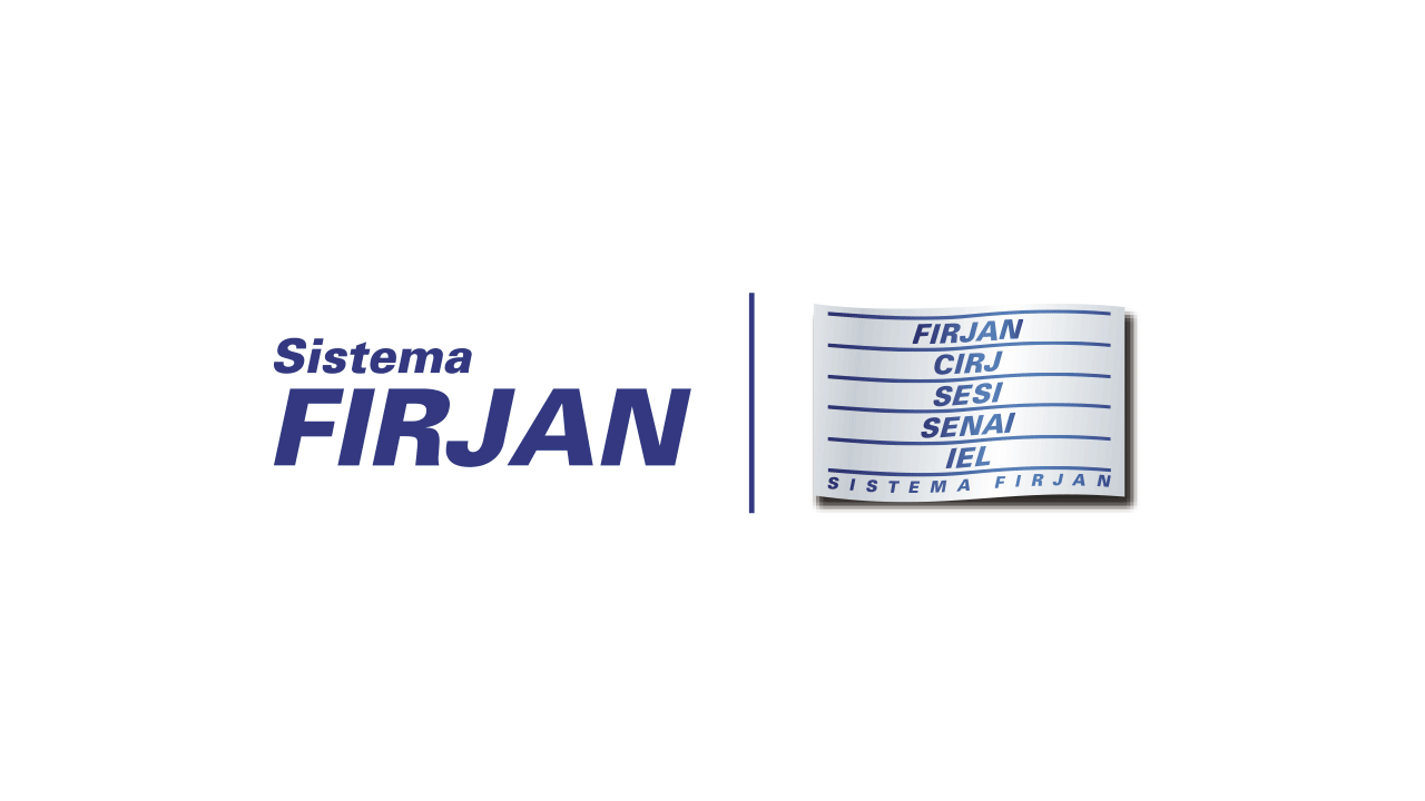
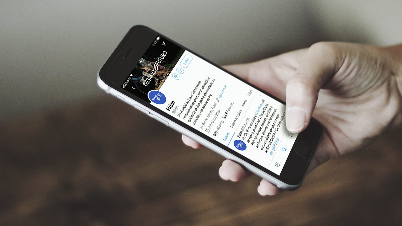
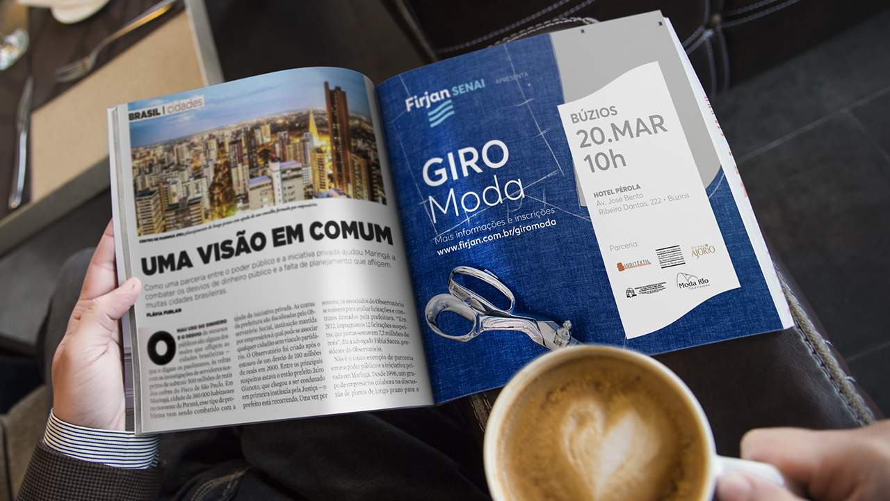
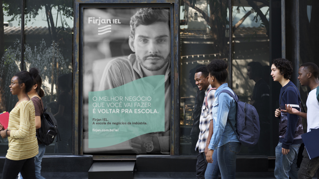
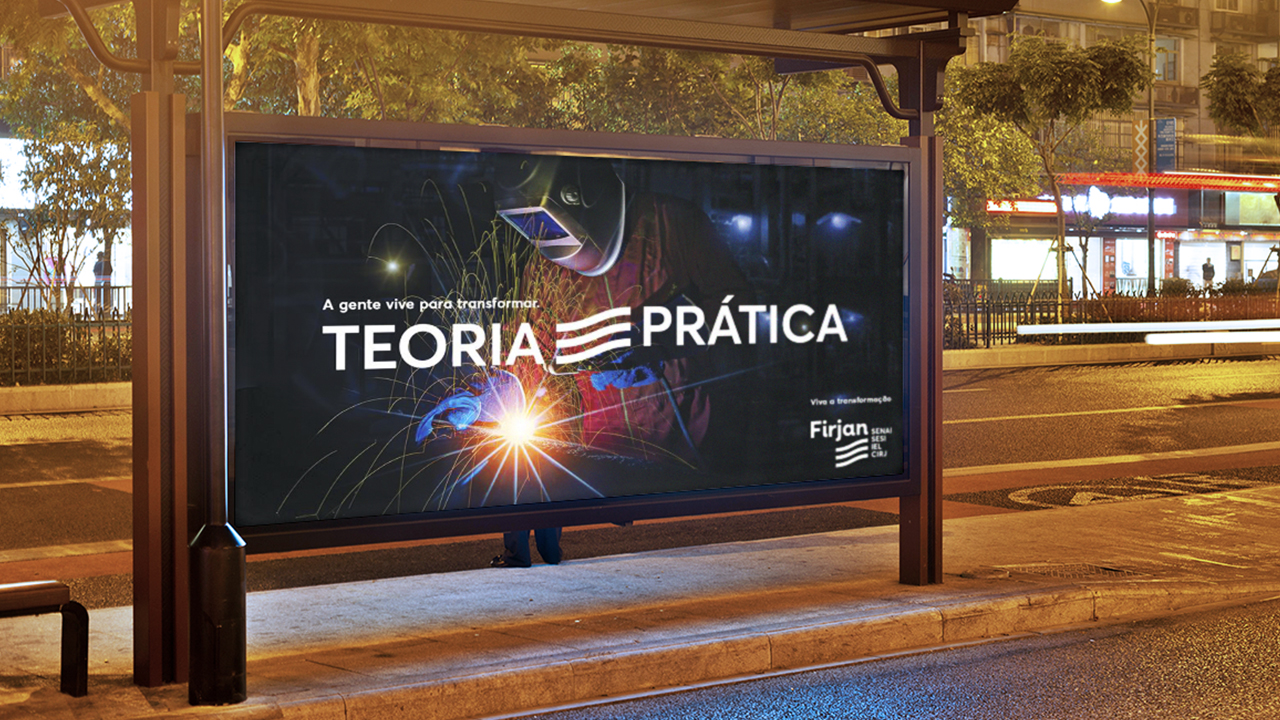
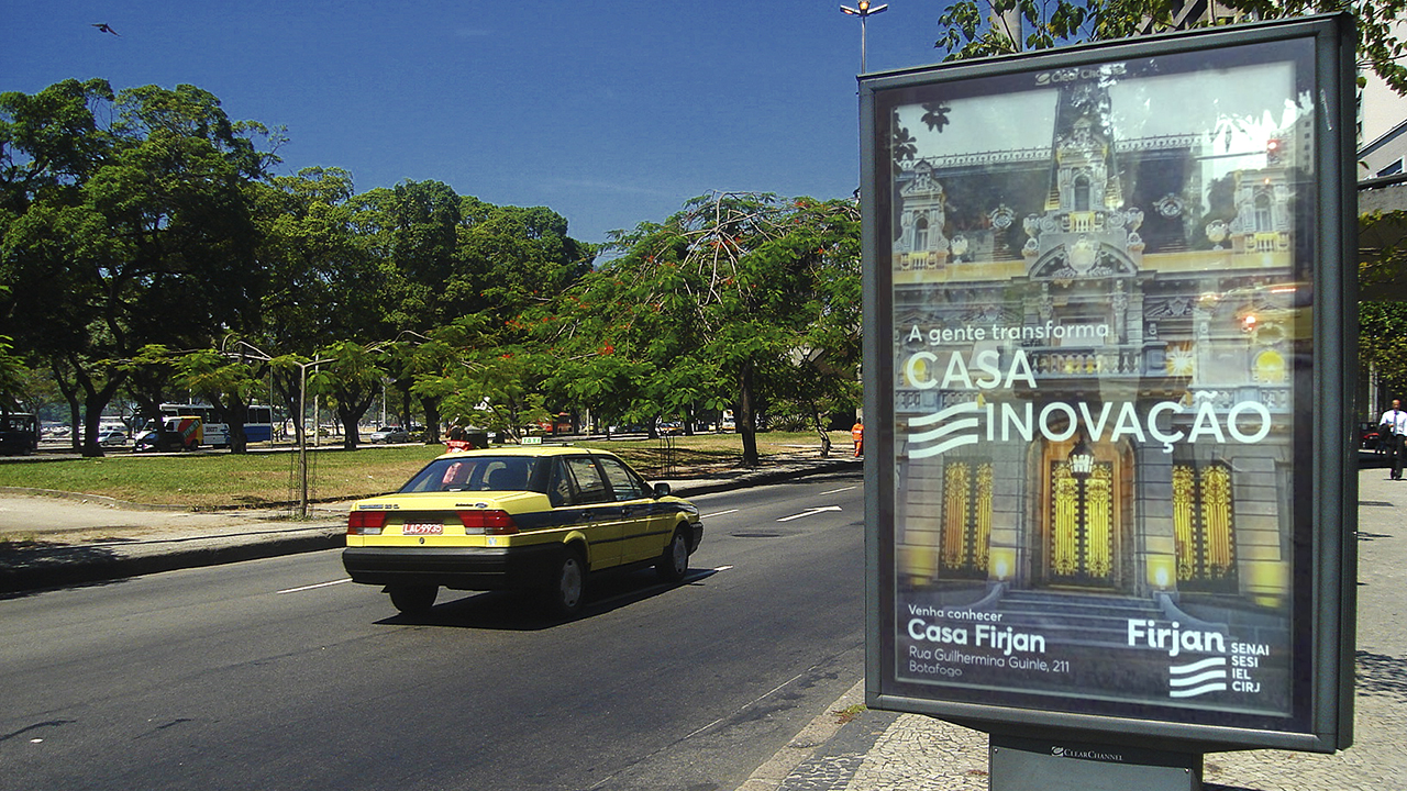
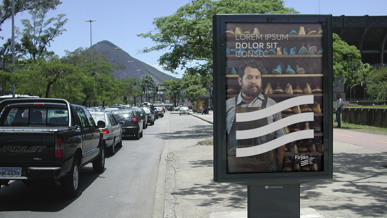
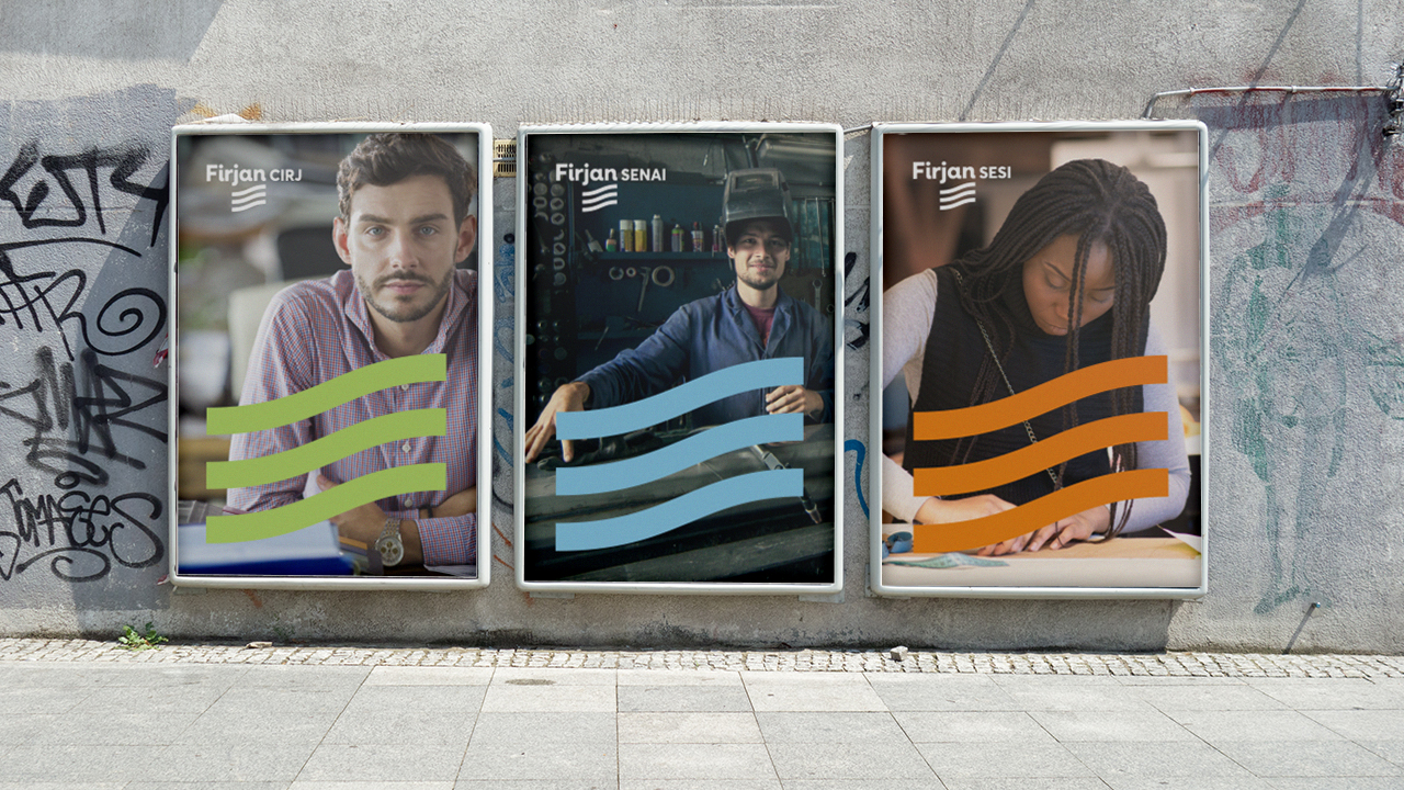
Firjan
@ Geometry Global (RJ)
“How can we update our brand and make it reflect the changes we’re going
through?” That was the challenge set by Firjan (Rio de Janeiro’s Industry
Federation), one of the greatest references for both people and Market, even
before they realize what they needed most: reestablish brand's connection with
entrepreneurs and society.
With a messy brand architecture – in which secondary brands stand out – and misleading codes that reminded public institutions, Firjan was not related to many benefits it offered the population and also was not acknowledged by part of industry as its representative.
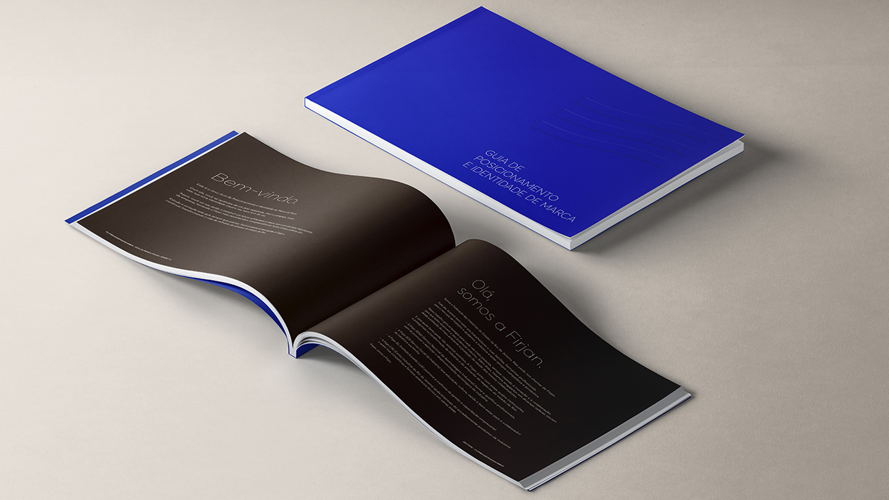
Working closely with the company's communication team, the main purpose became clear: it was critical to turn Firjan into protagonist and make it accessible again. Thus, we strived to design a new brand that had a strength that matches its reputation, a brand that could be closer without giving up its credibility.
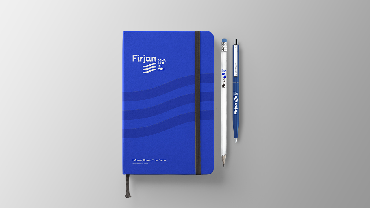
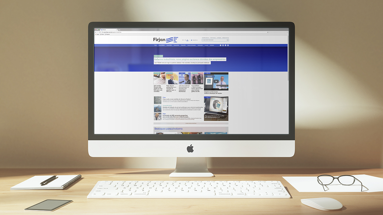
The new brand comes with a modern, minimalist, bold and casual language. We left behind the word “system” and, from now on, Firjan is no longer an acronym, written in all capital letters, and becomes a proper name of someone with whom people can relate to and count on. The icon, which was inexpressive and blended with institutions names, now stands out. Graphic, modern and dynamic, the flag brings the essence of Rio organic forms and points, in its upward movement, the growth of both industry and state.
The brand architecture was completely redesigned in a much simpler way according to the brand’s new strategy. From now on, every institution that make up the system bear the name of Firjan along with its acronyms to make it easier for the public to understand.
Firjan now has a strong, contemporary and versatile brand, enabling a greater number of applications. The new brand, in line with the company's new positioning, reflects a modern institution, simpler, agile and close to all its audiences, in tune with new times and new demands.
With a messy brand architecture – in which secondary brands stand out – and misleading codes that reminded public institutions, Firjan was not related to many benefits it offered the population and also was not acknowledged by part of industry as its representative.
Working closely with the company's communication team, the main purpose became clear: it was critical to turn Firjan into protagonist and make it accessible again. Thus, we strived to design a new brand that had a strength that matches its reputation, a brand that could be closer without giving up its credibility.
The new brand comes with a modern, minimalist, bold and casual language. We left behind the word “system” and, from now on, Firjan is no longer an acronym, written in all capital letters, and becomes a proper name of someone with whom people can relate to and count on. The icon, which was inexpressive and blended with institutions names, now stands out. Graphic, modern and dynamic, the flag brings the essence of Rio organic forms and points, in its upward movement, the growth of both industry and state.
The brand architecture was completely redesigned in a much simpler way according to the brand’s new strategy. From now on, every institution that make up the system bear the name of Firjan along with its acronyms to make it easier for the public to understand.
Firjan now has a strong, contemporary and versatile brand, enabling a greater number of applications. The new brand, in line with the company's new positioning, reflects a modern institution, simpler, agile and close to all its audiences, in tune with new times and new demands.
++ GEOMETRY GLOBAL (RJ)
Creative Director Ricardo Leme Lopes
Planning
Natascha Brasil
Creative Team
Daniel Souza; Erika Martins; Luna Uaná; Felipe Gaúcho; João Soares; Bernardo Medina; Laura Marques; Lydia Salgado; Gilmar Padrão
Account Management
Mirna Abaurre; Gabriela Zampirolli
Creative Director Ricardo Leme Lopes
Planning
Natascha Brasil
Creative Team
Daniel Souza; Erika Martins; Luna Uaná; Felipe Gaúcho; João Soares; Bernardo Medina; Laura Marques; Lydia Salgado; Gilmar Padrão
Account Management
Mirna Abaurre; Gabriela Zampirolli


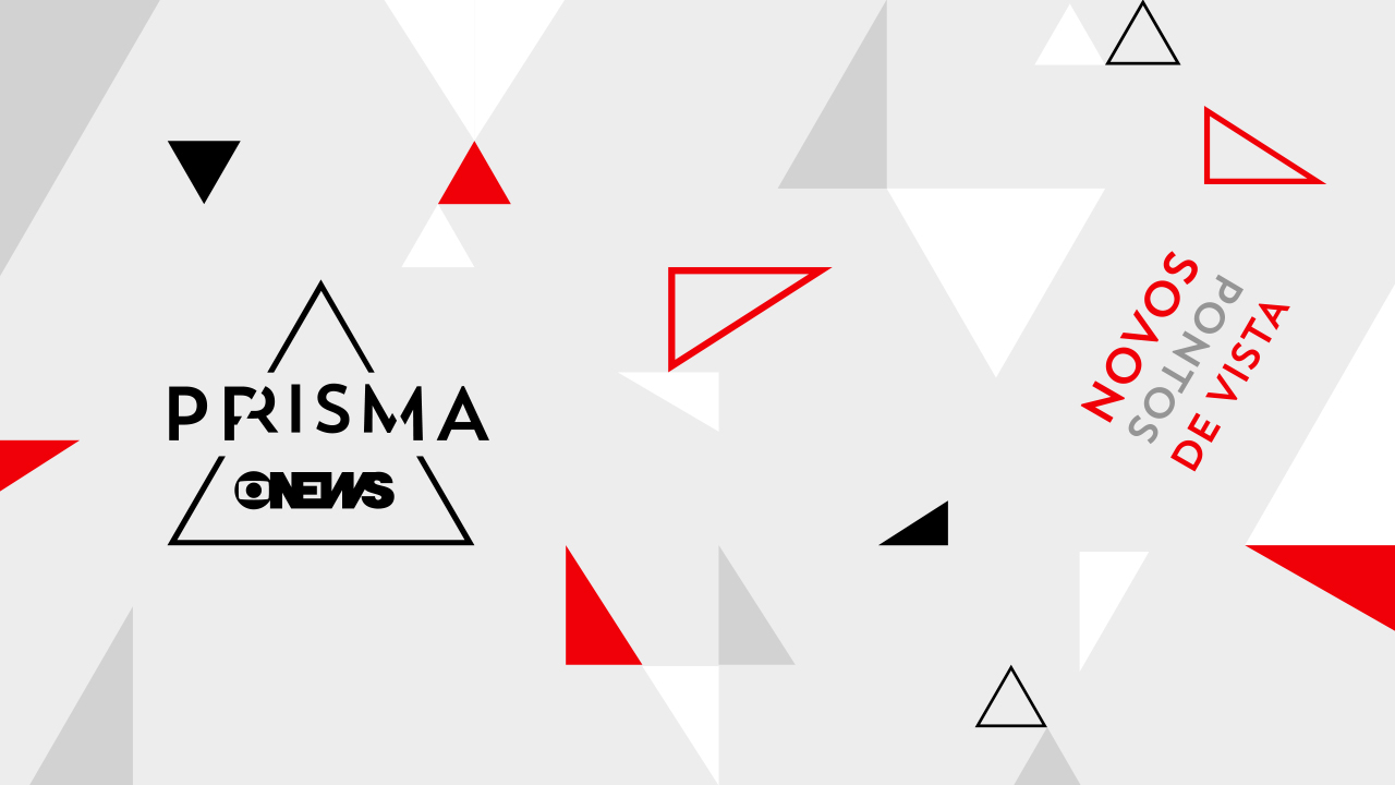
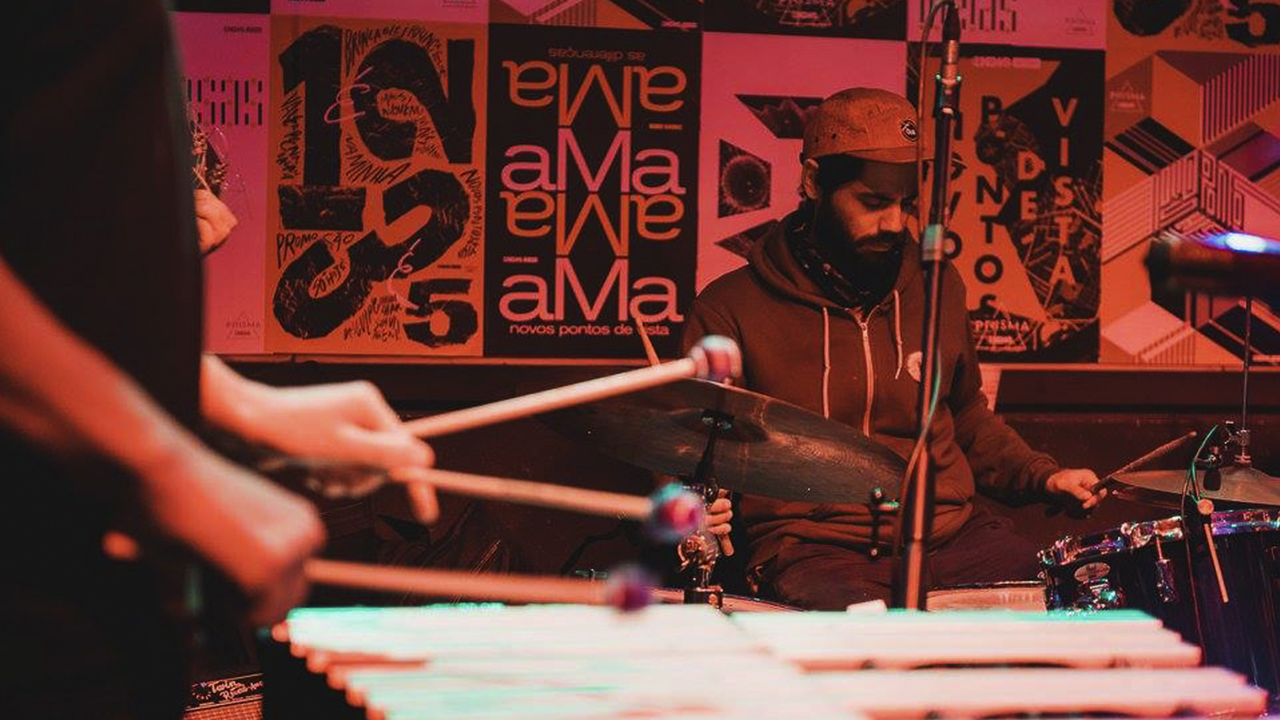
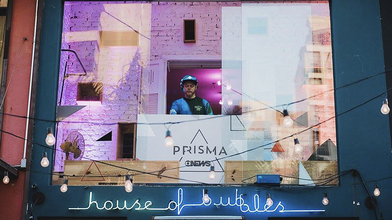
Globonews Prisma
@ Geometry Global (RJ)
Globonews, the largest news channel in Brazil, realized that it needed
to get closer to younger people besides its regular audience. But how could it
become something more than a news channel? It had to innovate in both content
and the way of transmitting it.
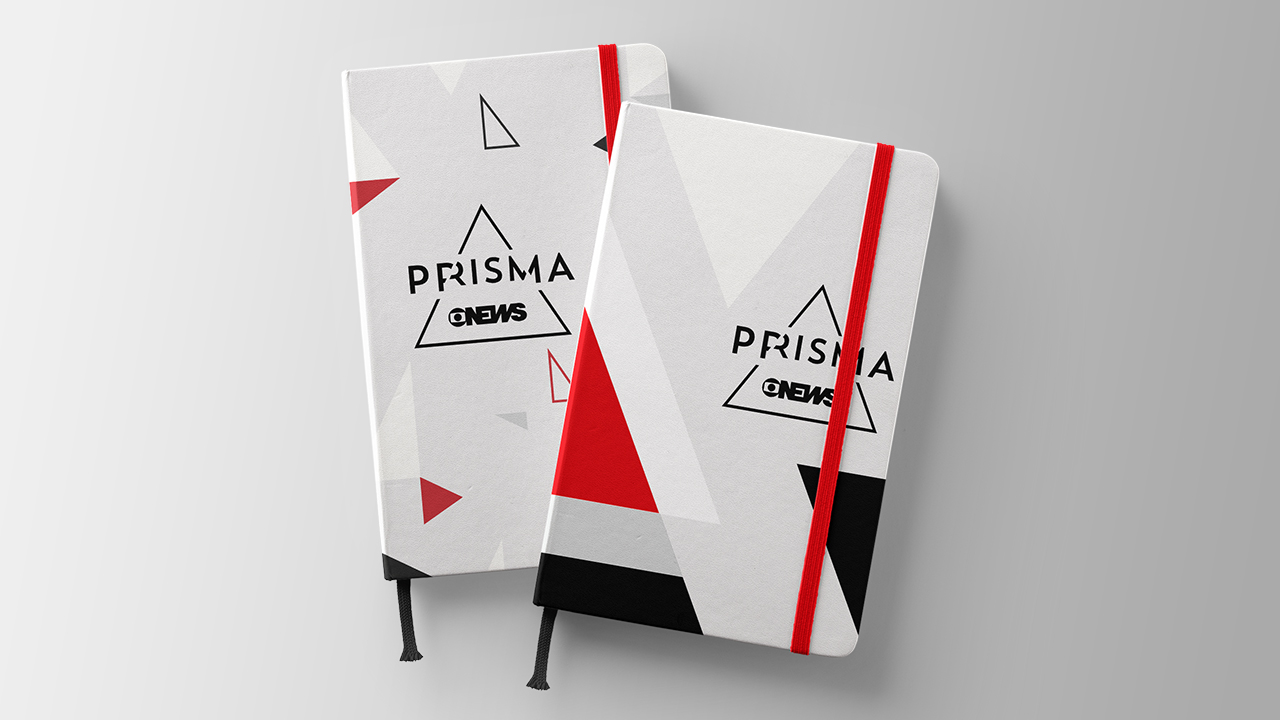
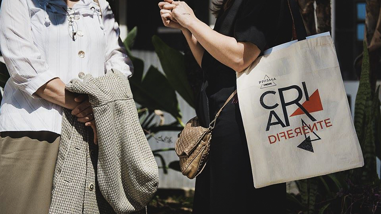
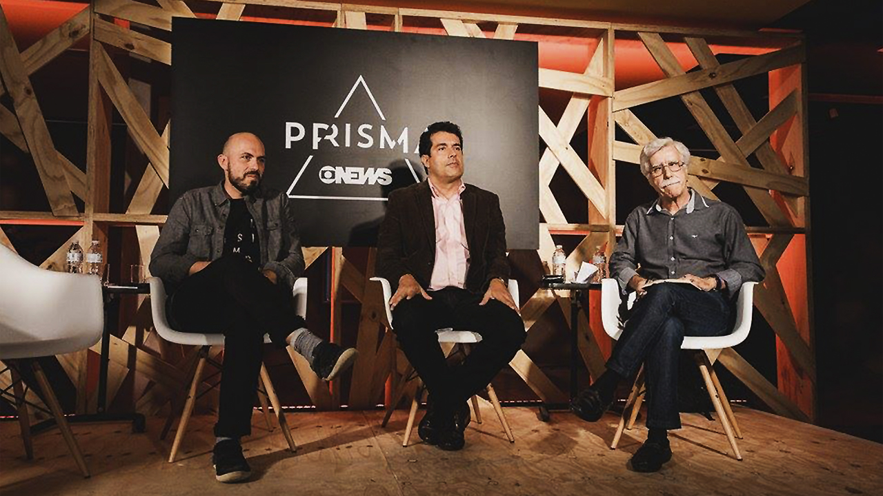
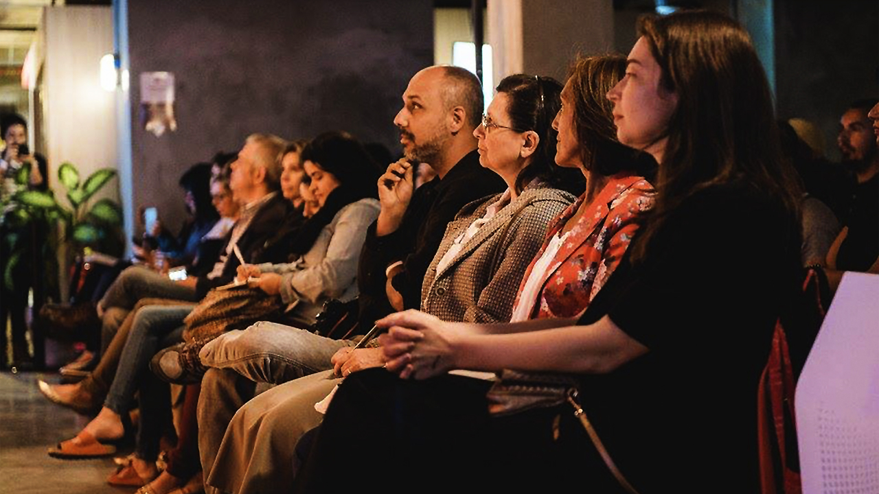
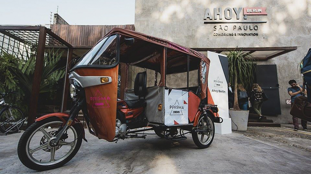
In partnership with channel’s team, we got to the "GloboNews Prisma" concept, a platform to connect people who are changing the world with issues that are shaping the future. The idea was to put together a festival-like event, with a program including lectures, round tables, workshops and even shows. It would take place simultaneously in several coworkings of São Paulo, besides the TV broadcast and content made available on-line.
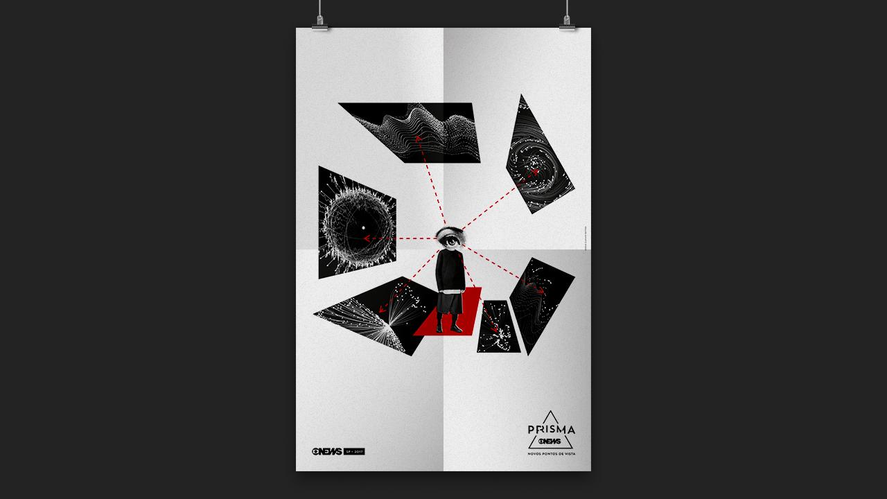
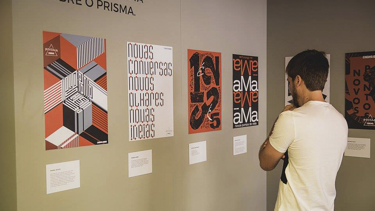
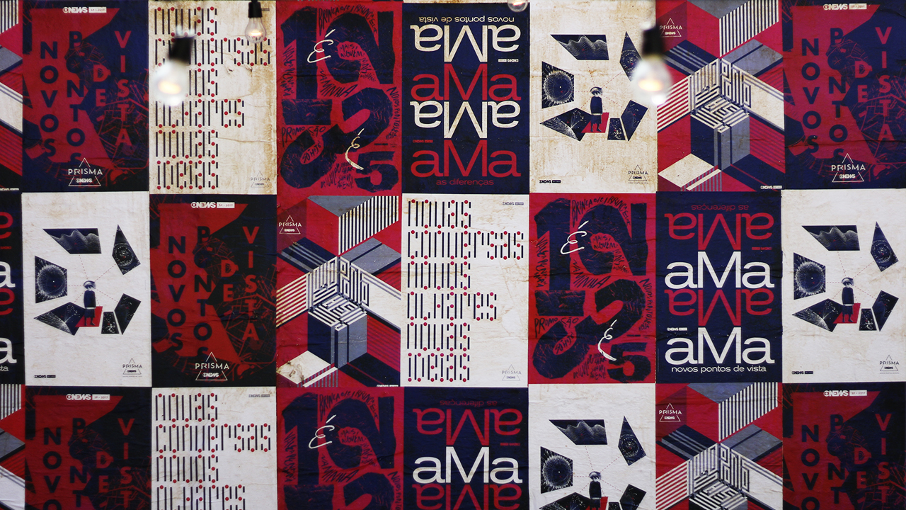
The visual identity of Prisma was the starting point for its entire digital platform, as well as its scenography, signage and welcome kits. To complete, 6 graphic designers – who are entrepreneurs in different cities (Rio de Janeiro, São Paulo and London) – were invited to express their own points of view on the concept of the event. The result was a unique collection of posters that turned into an exhibition during the event, besides being used as scenography and communication.
The result of this initiative was quite expressive. With just one day, the event has completerly changed the channel image. More than five million people impacted by TV and +300,000 online, generating 98% of positive comments. The event was so successful that the second edition has already been scheduled for 2018.
In partnership with channel’s team, we got to the "GloboNews Prisma" concept, a platform to connect people who are changing the world with issues that are shaping the future. The idea was to put together a festival-like event, with a program including lectures, round tables, workshops and even shows. It would take place simultaneously in several coworkings of São Paulo, besides the TV broadcast and content made available on-line.
The visual identity of Prisma was the starting point for its entire digital platform, as well as its scenography, signage and welcome kits. To complete, 6 graphic designers – who are entrepreneurs in different cities (Rio de Janeiro, São Paulo and London) – were invited to express their own points of view on the concept of the event. The result was a unique collection of posters that turned into an exhibition during the event, besides being used as scenography and communication.
The result of this initiative was quite expressive. With just one day, the event has completerly changed the channel image. More than five million people impacted by TV and +300,000 online, generating 98% of positive comments. The event was so successful that the second edition has already been scheduled for 2018.
++ GEOMETRY GLOBAL (RJ)
Creative Director Ricardo Leme Lopes
Creative Team
Alexei Potemkin; Daniel Souza; João Miller; Leonardo Mangiavacchi; Luna Uaná; Fábio Maia; João Soares; Bernardo Medina; Laura Marques; Lydia Salgado; Anderson Roque; Gilmar Padrão
Account Management
Mirna Abaurre; Karla Ribeiro; Júlia Teykal; Camila Pesce
Guest Designers (Posters)
Angelo Bottino; Estúdio Relâmpago; Paloma Valls; Rejane Dal Bello; Thiago Lacaz
Awards
. Wave Festival
. Lusófonos de Criatividade
. Colunistas RJ


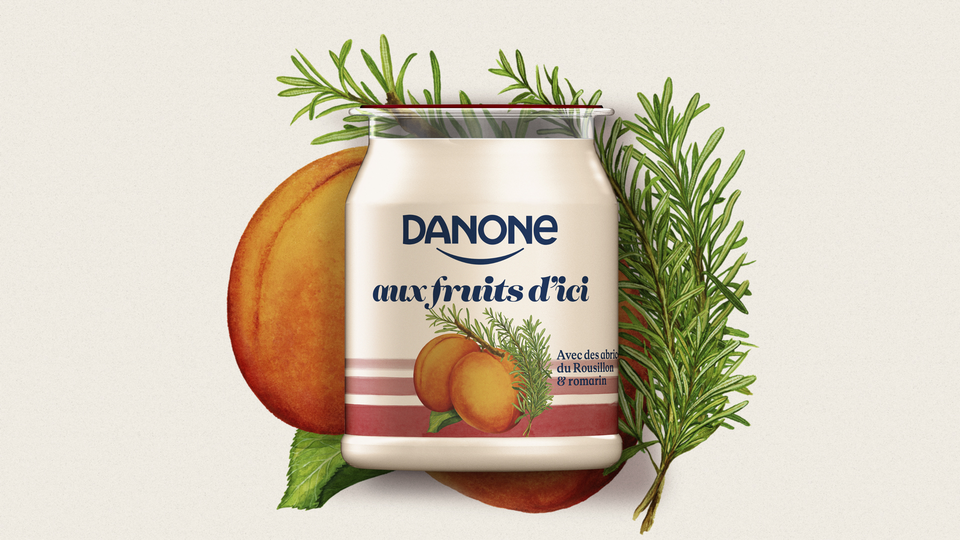
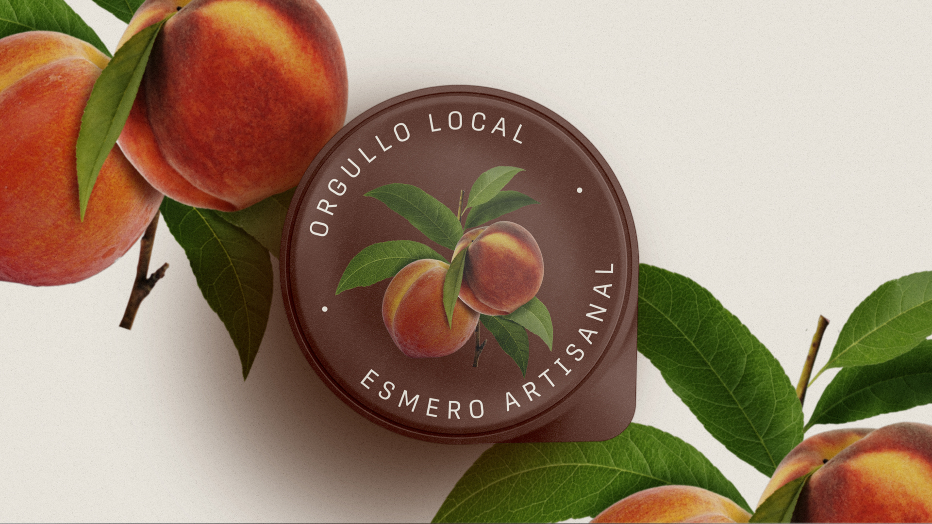
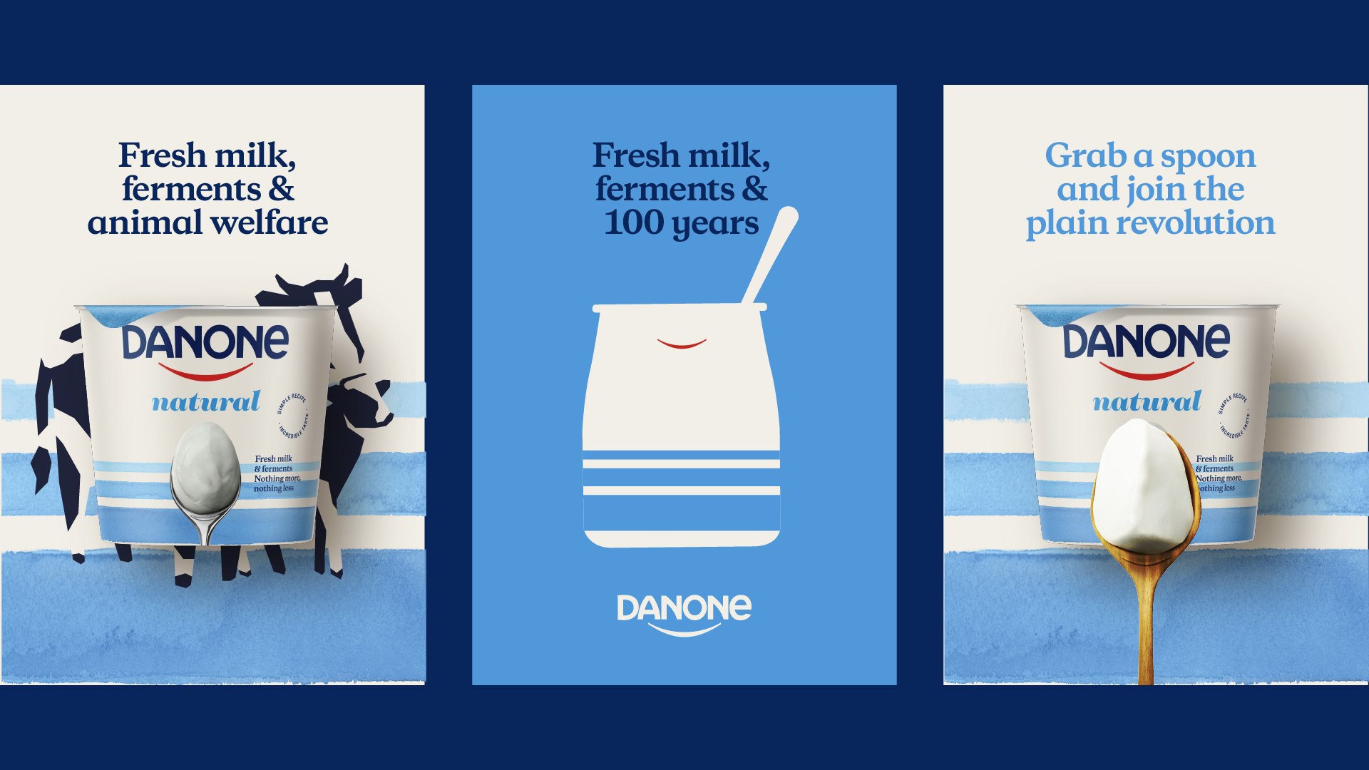
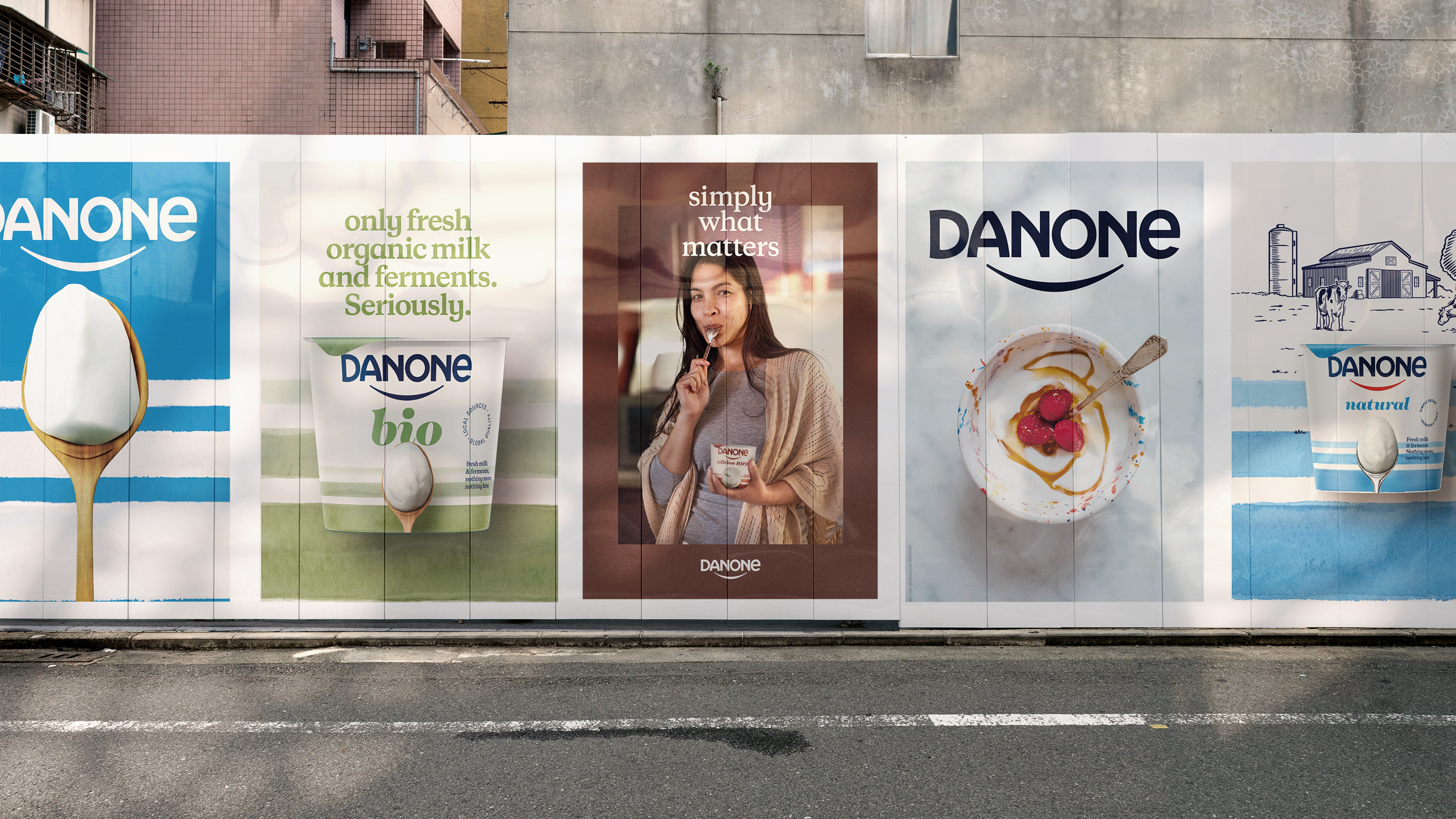
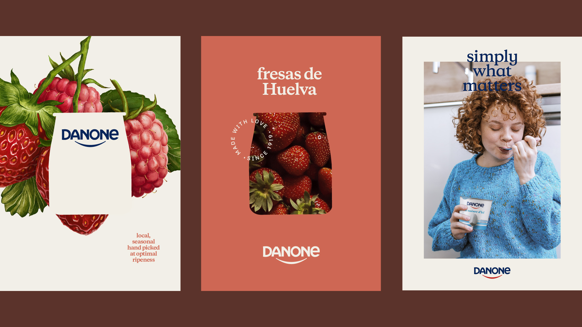
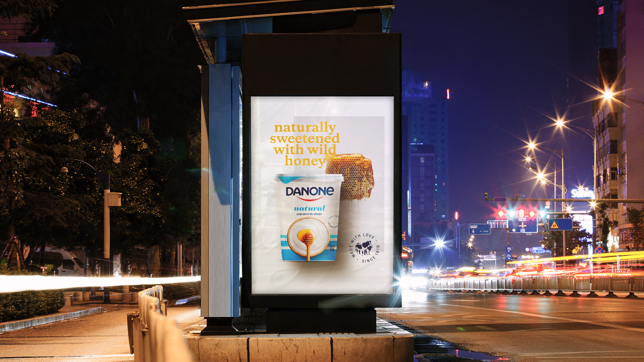
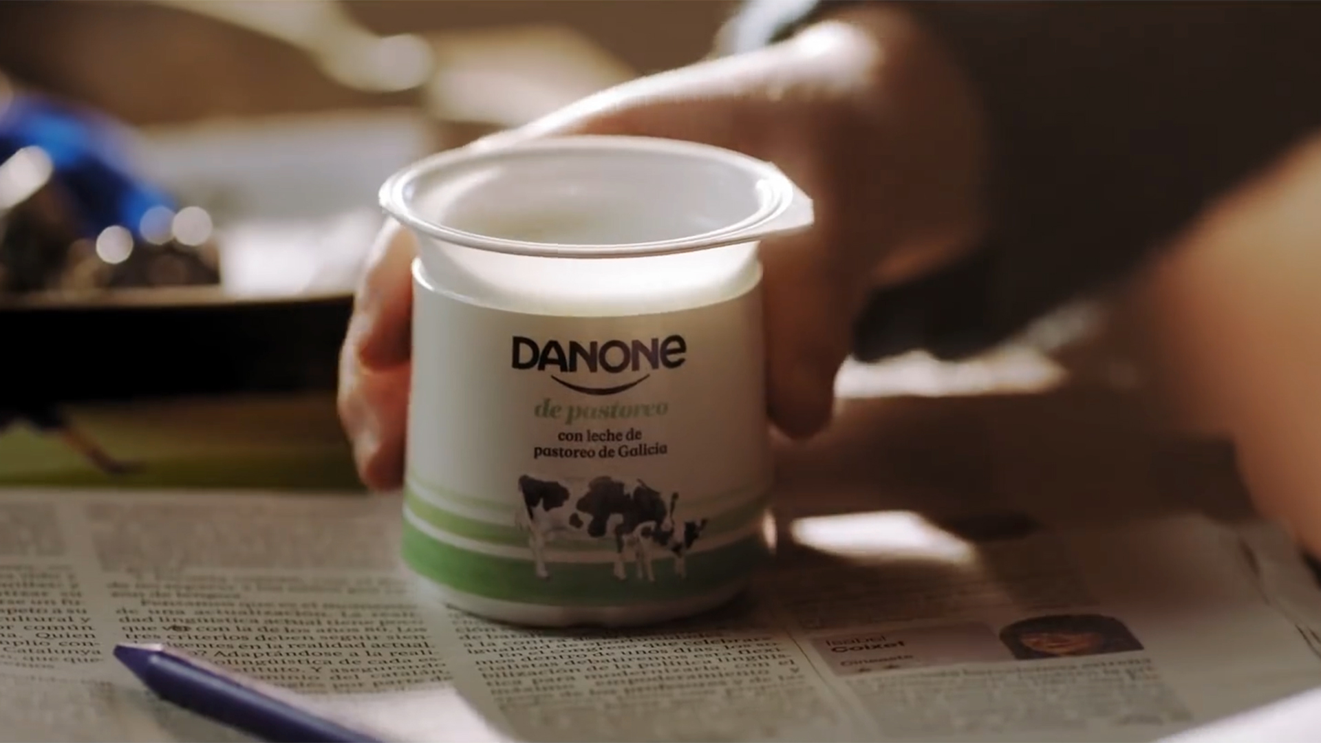
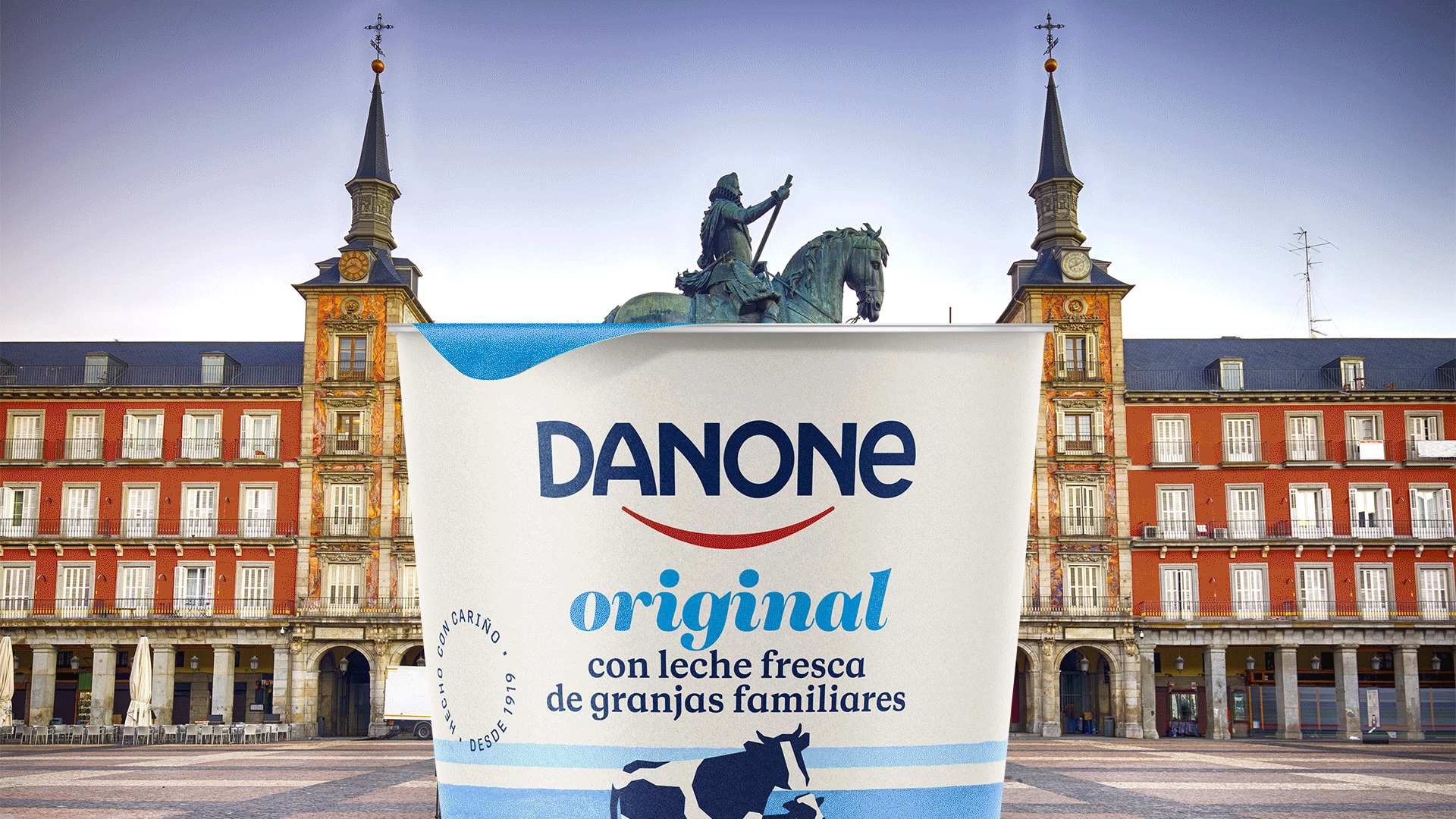
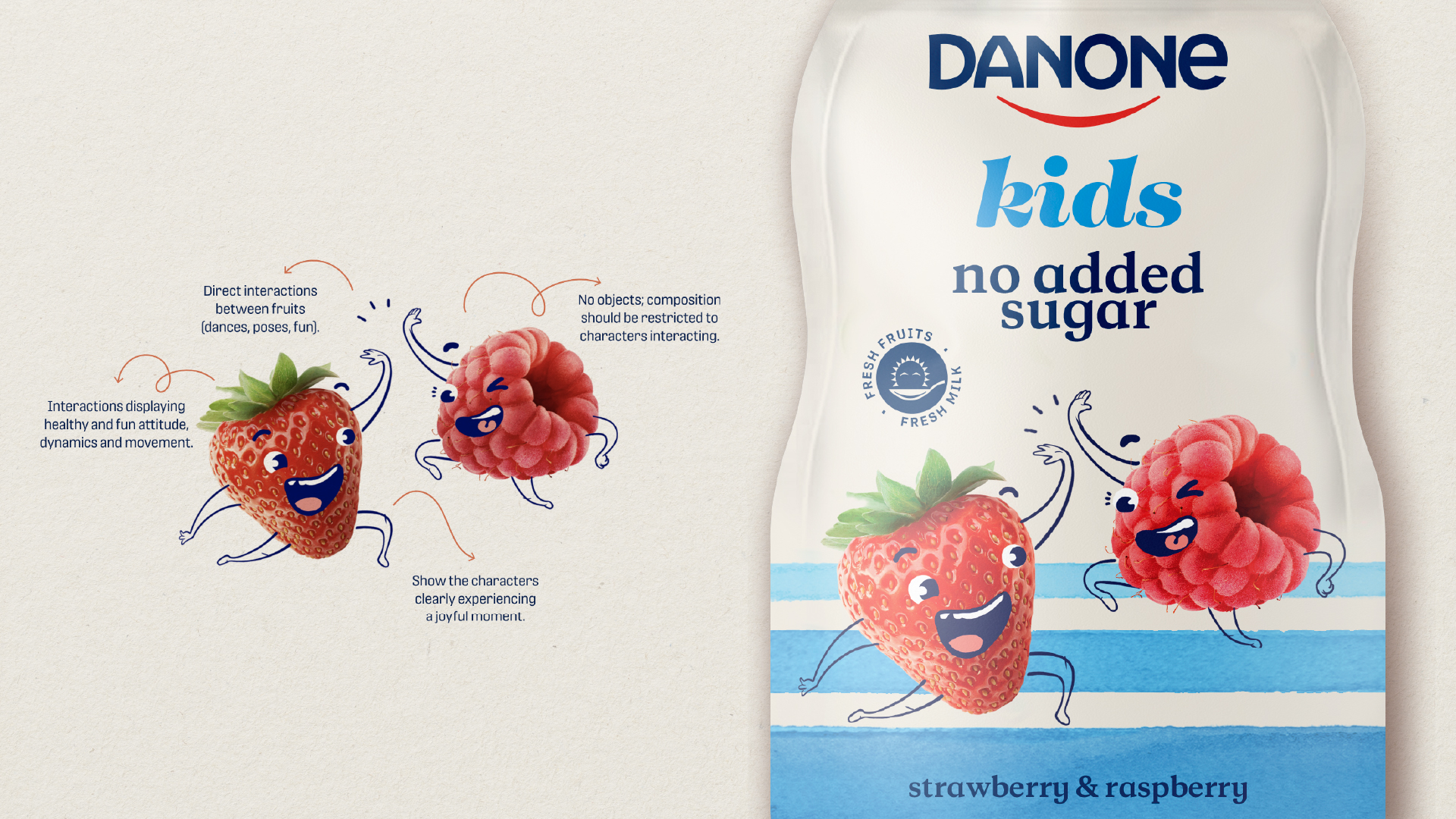
Danone Packaging System
@ Tatil Design de Ideias
Danone's challenge goes beyond packaging redesign: how to reposition a global brand with 100+ years of history, which is synonymous with its product category, making yogurt attractive to new generations? It's a project to help the brand and its products moving in the direction of contemporary desires.
To do that we reinterpreted visual and emotional codes that the brand has built over 100 years and transformed the Simple Goodness concept into something new, vibrant and systemic. We designed a system in which each element is essential in the construction of storytelling. It's assisted by texts that mix clarity, synthesis and the right amount of humor to create proximity and communicate attributes – such as naturalness, flavors, ingredients, purpose and sustainability – in a light and contemporary way.
The project was developed to be implemented in countries with very different contexts, cultures, market challenges and consumption habits. For this reason, we created a rationale that converges towards the construction of a single brand, but that simultaneously opens space for particularities. A global and local system, consistent and flexible, tailored to communicate the brand's differentials and values.
More than the creation of a broad and strategic design system, we redesigned the brand's product portfolio based on the developed guidelines. The work was done in partnership with Danone's global and local teams in 17 countries.
++ TATIL DESIGN DE IDEIAS
CEO
Fred Gelli
Creative Team
Ana Amélia; Ana Cunha; Anna Fonseca; Andréa Kulpas; Bruna Aragão; Clauber Trivoli; Daniel Escudeiro; Daniel Souza; Gilmar Padrão; Gisele Camara; João Augusto; Julia Custodio; Lucas Mayer; Mariane Silva; Paulo Ferreira; Pedro So; Renan Benvenuti; Renan Vizzotto; Ricardo Bezerra; Thomas Botelho; Valéria Forte
Account Management
Anthonia Nanci; Celso Onofre; Juliana Gattaz; Luisa Simões
Illustrations
Pict Estudio


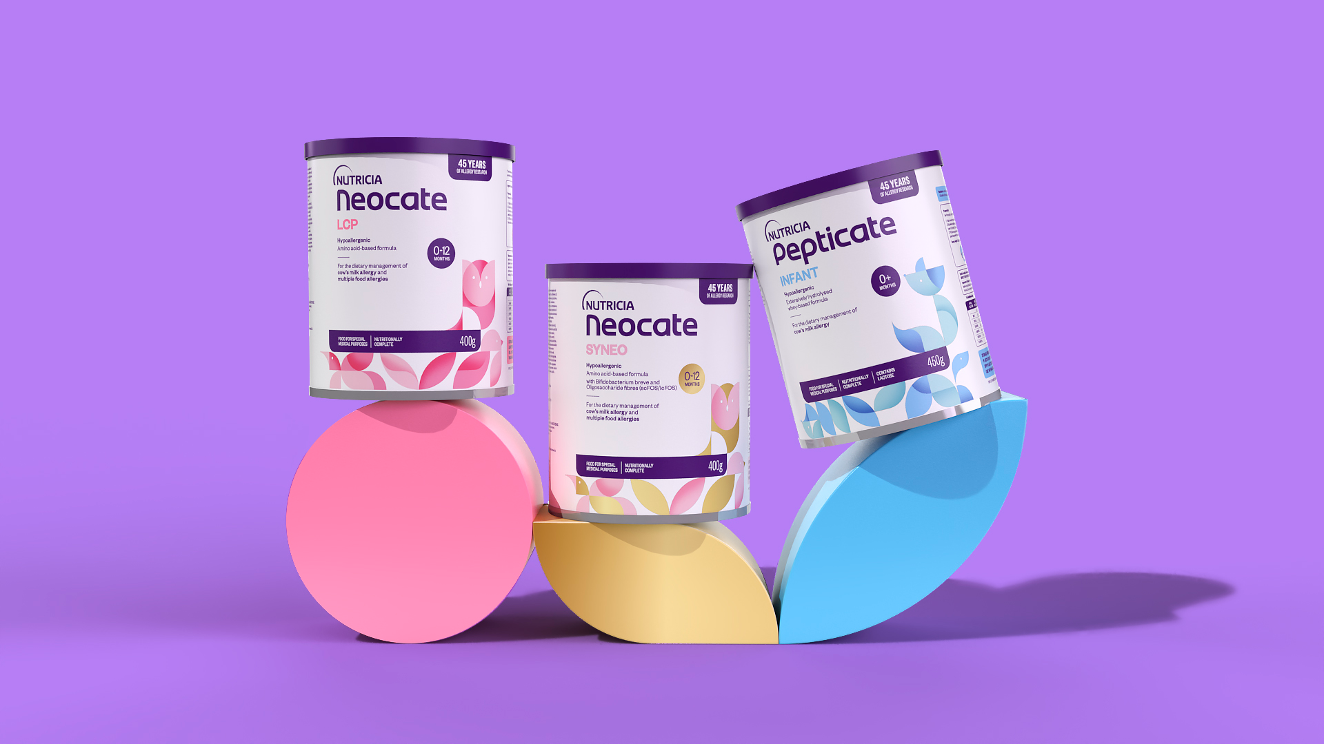
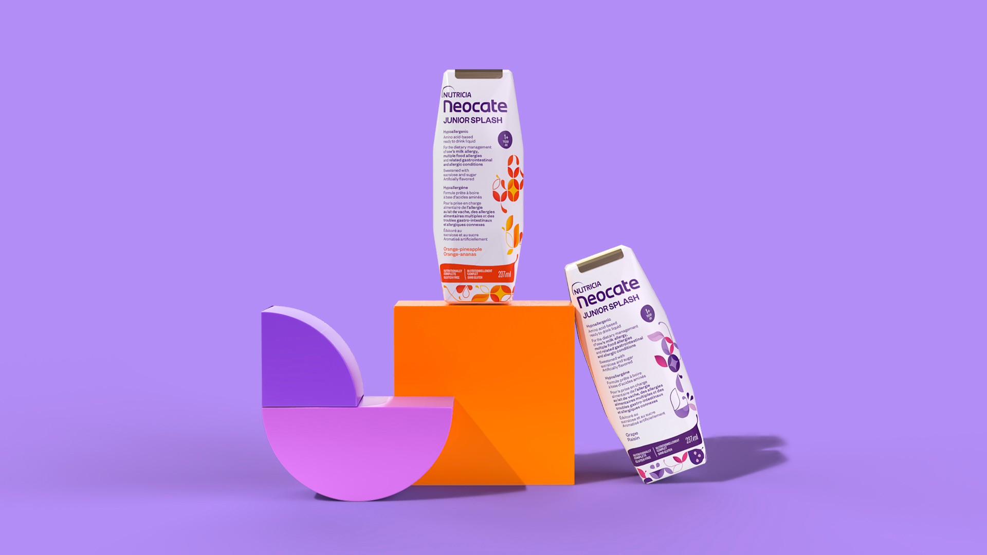
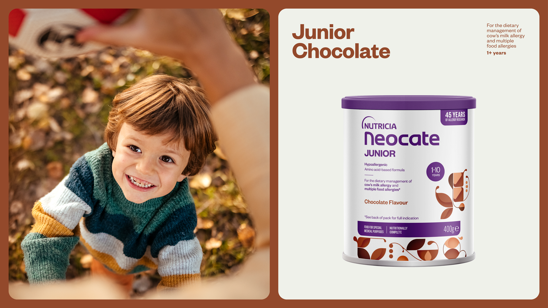
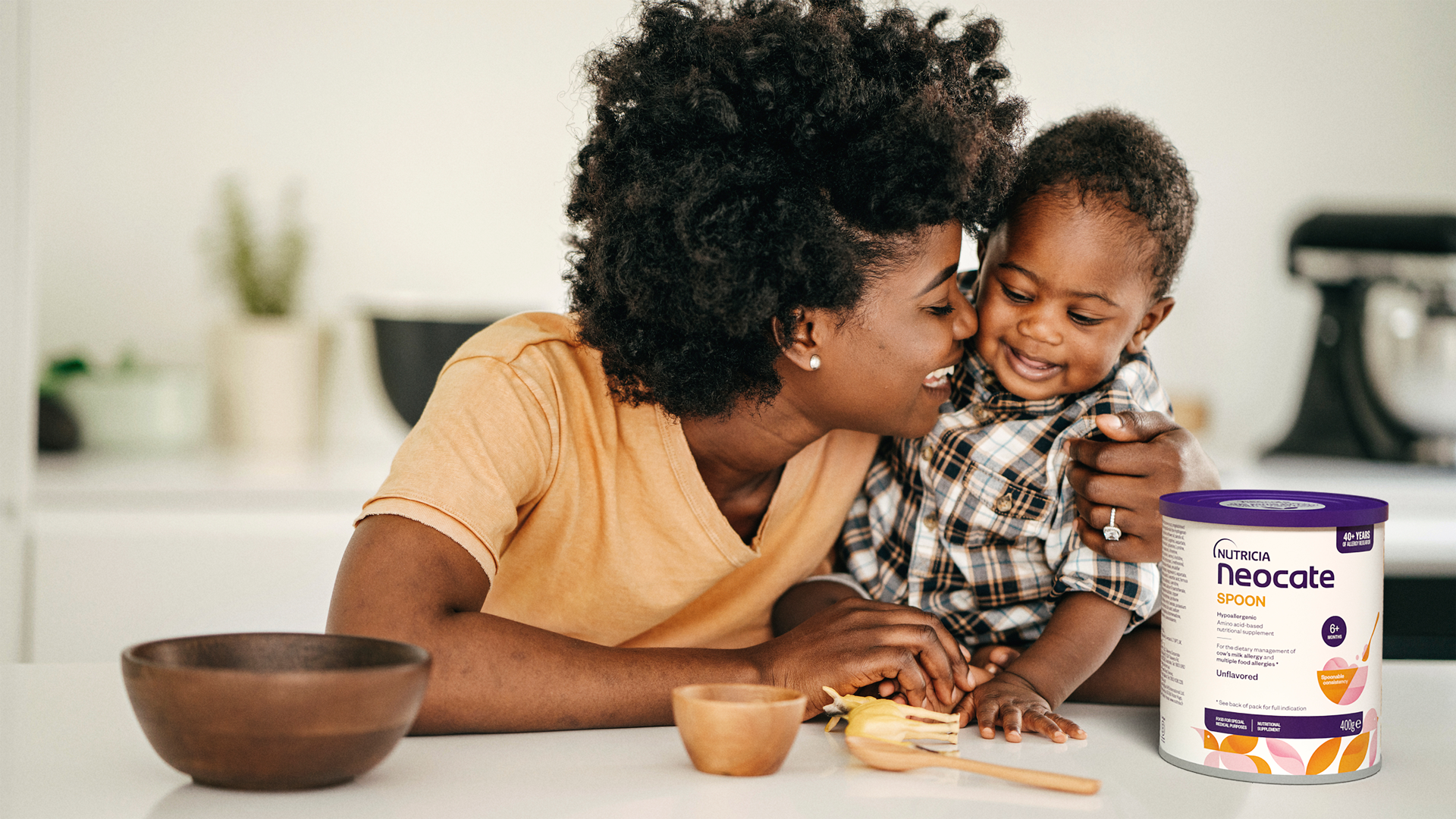
Neocate VIS
@ Tatil Design de Ideias
Neocate has been a pioneer in treating food allergies for over 40 years, providing vital nutritional solutions for infants with conditions like Cow’s Milk Allergy (CMA). When the brand sought to redesign its packaging, the challenge was to blend its scientific expertise with the emotional reassurance parents need during sensitive moments.
The creative strategy focused on developing a visual identity that balanced playfulness and precision. Drawing inspiration from the children’s world, exclusive illustrations were crafted based on stacking blocks—a timeless symbol of childhood and nurturing care. These elements were paired with modular geometric shapes to represent the scientific precision behind the formulas, creating a design language that felt both trustworthy and comforting.
Building on Nutricia’s iconic purple, the color system was refined to maintain brand familiarity while enhancing clarity. A simplified visual hierarchy was introduced to make it easier for both parents and healthcare professionals to navigate the product range, ensuring effortless selection of the right formula.
This new packaging system brought Neocate’s values into sharper focus, reinforcing its commitment to both scientific excellence and emotional reassurance. It not only enhances clarity but also invites trust and comfort in moments that matter most.
++ TATIL DESIGN DE IDEIAS
Creative Director
Daniel Souza
Creative Team
Andrea Kulpas, Cesar Gomes, and Mariane Silva
Planning
Evelyn Costa
Production
Emmanuel Zanoni and Valeria Forte
Account Management
Juliana Gattaz and Thaiz Crepaldi
Illustrations
Pict Estudio
Creative Director
Daniel Souza
Creative Team
Andrea Kulpas, Cesar Gomes, and Mariane Silva
Planning
Evelyn Costa
Production
Emmanuel Zanoni and Valeria Forte
Account Management
Juliana Gattaz and Thaiz Crepaldi
Illustrations
Pict Estudio


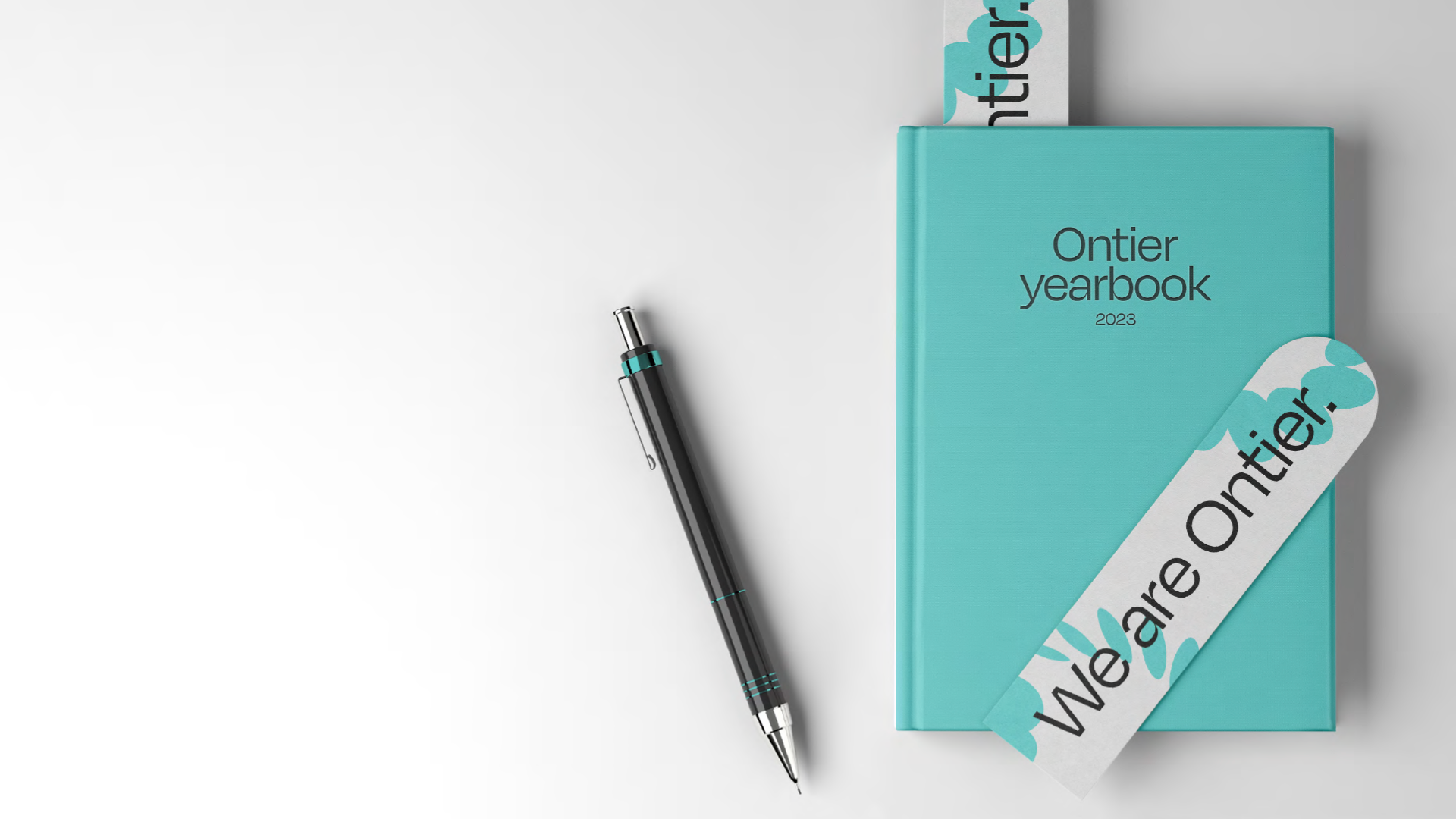
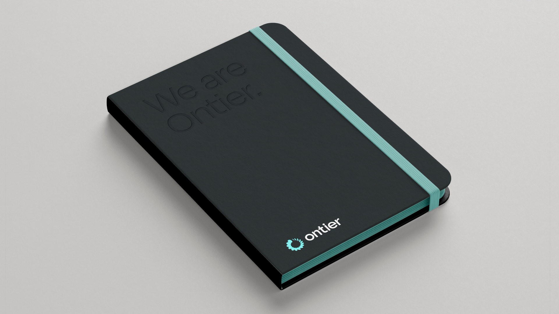
Ontier
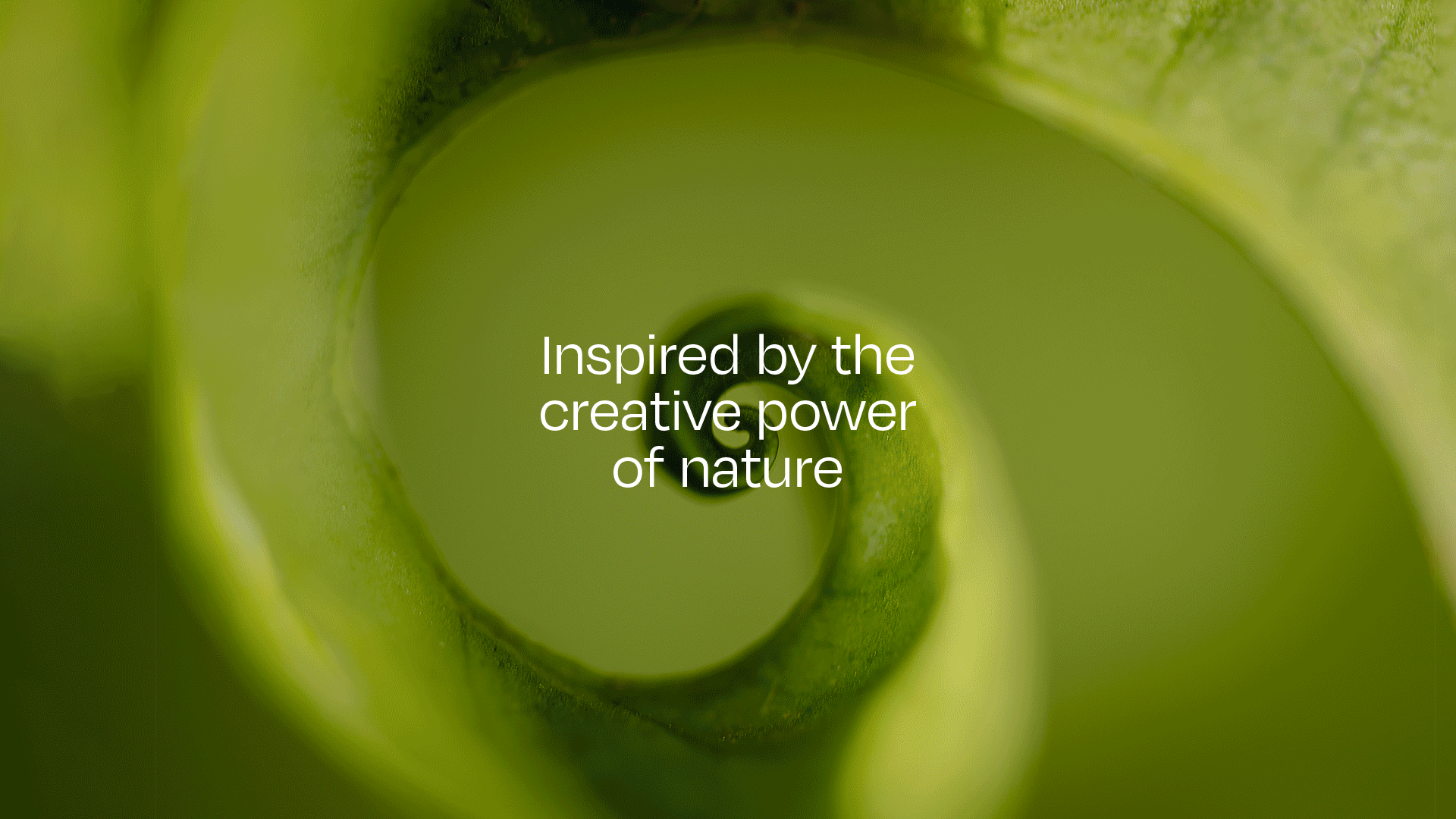
@ Tatil Design de Ideias
Ontier is more than a multinational law firm—it’s a dynamic, forward-thinking partner that blends global expertise with deep local knowledge. As the firm expanded across continents, it needed a bold new identity that reflected its ability to navigate complexity and shape the future of legal consultancy.
Inspired by the transformative power of nature, the new design system is built around the spiral—a universal symbol of growth, rhythm, and evolution. This core element informs a flexible, ever-adapting visual language that mirrors Ontier’s ability to anticipate change and act swiftly.
From logo refinement to brand applications across stationery, environments, and digital platforms, every detail was crafted to reinforce Ontier’s presence as an expert, unconventional, and deeply committed partner. A custom-built creative tool generates infinite variations of motion and graphics, allowing the brand to evolve seamlessly across different markets and contexts.
This identity isn’t just a visual update—it’s a reflection of Ontier’s evolving role in the legal world. It brings clarity and adaptability to a complex global landscape, ensuring the brand remains as forward-thinking as the firm.
++ TATIL DESIGN DE IDEIAS
Creative Director
Daniel Souza
Creative Team
Ana Amélia Martino, Mariane Silva, and Patrícia Licio
Copywriting
Ana Cunha and Pedro Só Martins
Planning
Carolina Polli and Paula Marchiori
Production
Emmanuel Zanoni and Valeria Forte
Account Management
Juliana Gattaz and Thaiz Crepaldi
Creative Director
Daniel Souza
Creative Team
Ana Amélia Martino, Mariane Silva, and Patrícia Licio
Copywriting
Ana Cunha and Pedro Só Martins
Planning
Carolina Polli and Paula Marchiori
Production
Emmanuel Zanoni and Valeria Forte
Account Management
Juliana Gattaz and Thaiz Crepaldi


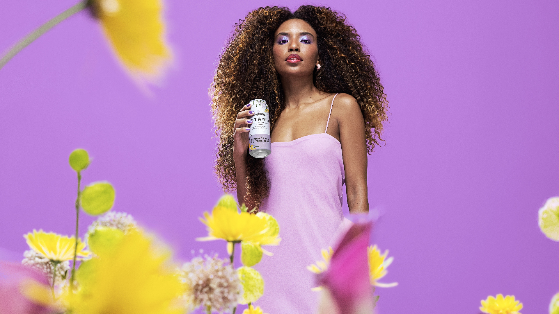
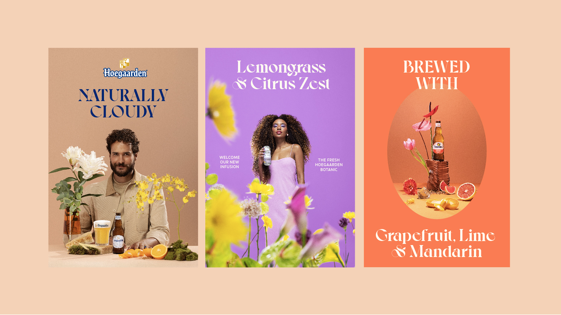
Hoegaarden VIS
@ Tatil Design de Ideias
AB Inbev invited us to revitalise the global image of Hoegaarden, a brand with centuries of tradition that sought to update its presence in key markets.
Starting from the essence of a "Sublime Garden", the brand's symbolic universe, we delve into its iconography, respecting Hoegaarden’s history but elevating it with a contemporary touch. Using the product as the hero, we created a new inspiring garden where nature and ingredients merge into a unique narrative.
Updated illustrations, photography and typography create a cohesive and stimulating visual set. We rescued the iconic packaging illustrations, expanding Hoegaarden's visual universe to include the manufacturing process and garden elements.
With refined technique and close collaboration with the client, we develop a language that strengthens the brand's presence in all aspects.
In photography, we sought to reflect the aromas and flavours of each beer, exploring vibrant colours and natural elements to create an aspirational and impactful atmosphere that complemented the brand's new visual language.
++ TATIL DESIGN DE IDEIAS
Creative Director
Daniel Souza
Creative Team
Jade Aiello, Caio Reis, Mari Silva, Cesar Goes, Stephanye Parraga, João Augusto Zanin and Thalita Campbell
Planning
Juliana Barreto and Letizia Trannin
Production
Valeria Forte
Account Management
Juliana Gattaz and Thaiz Crepaldi
Photography
Doma
Illustrations
Steven Noble


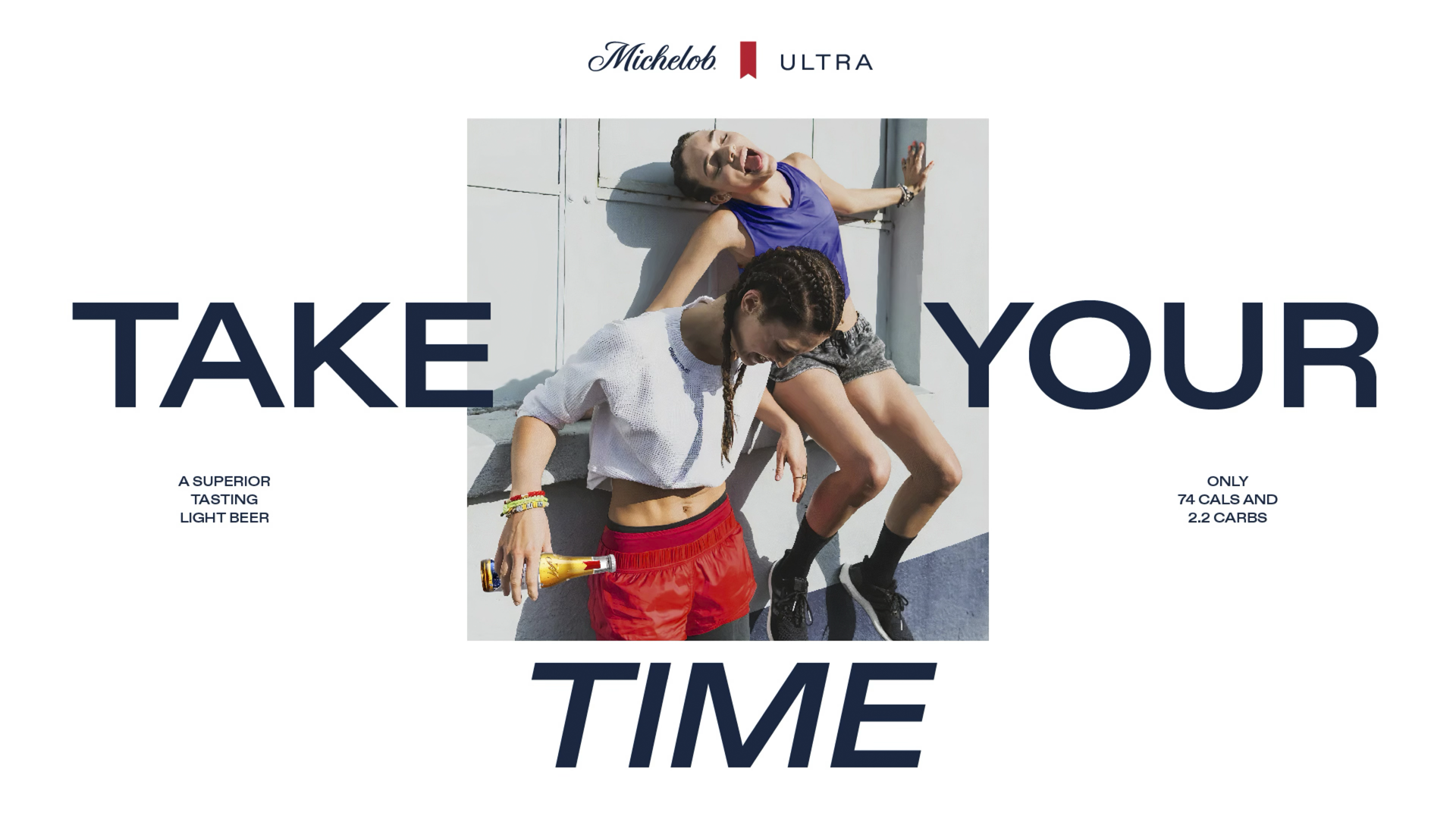
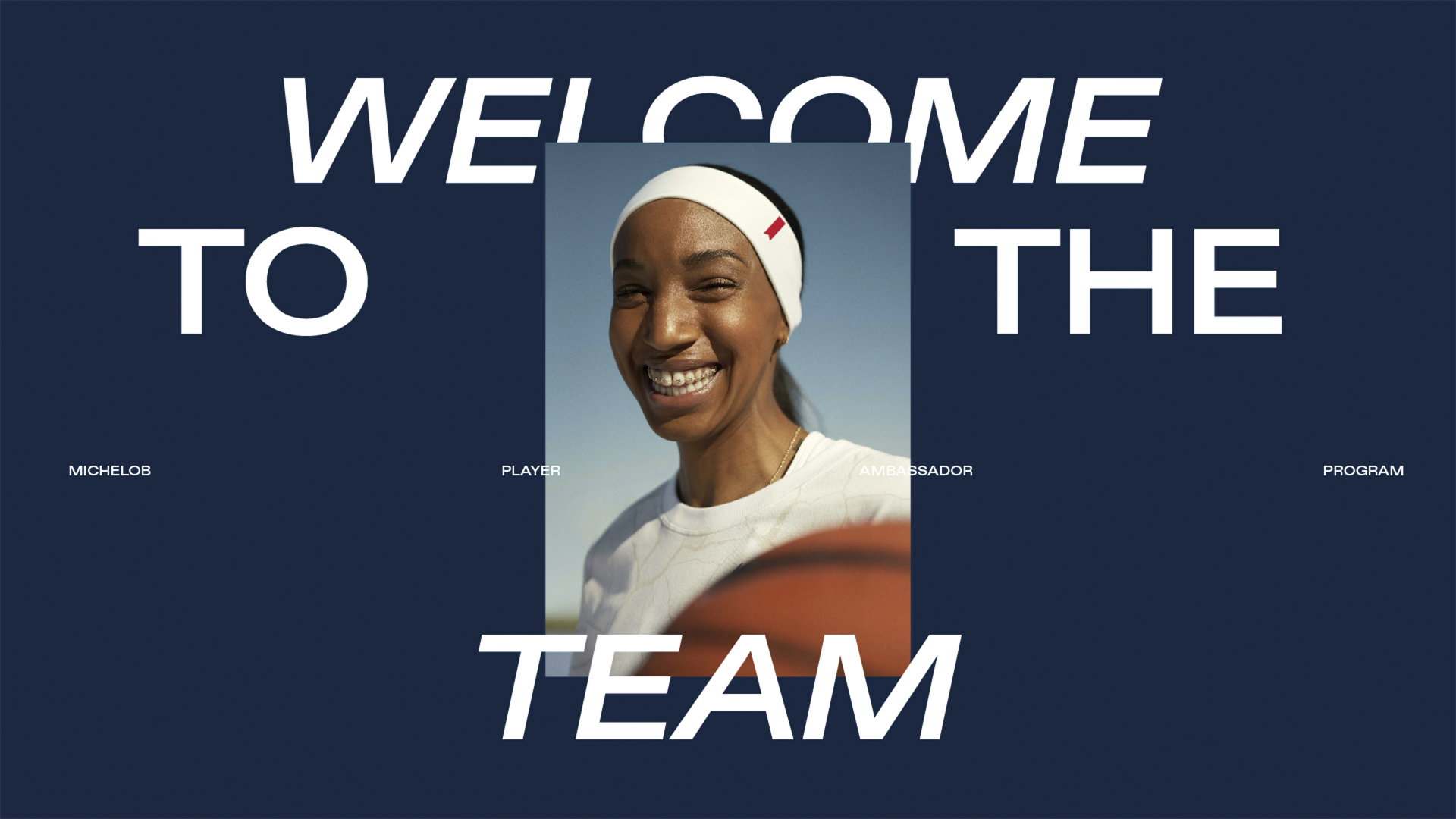
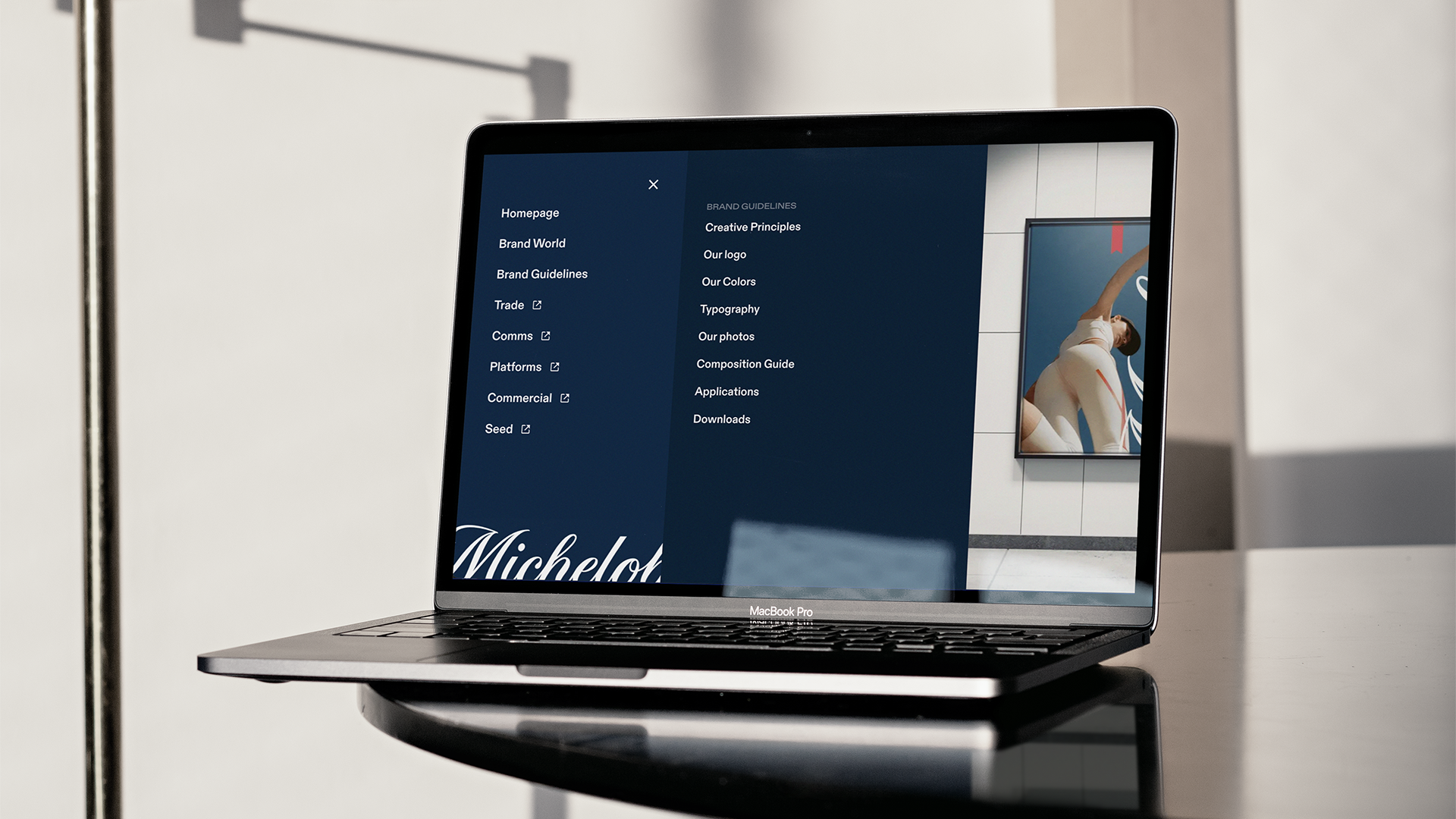
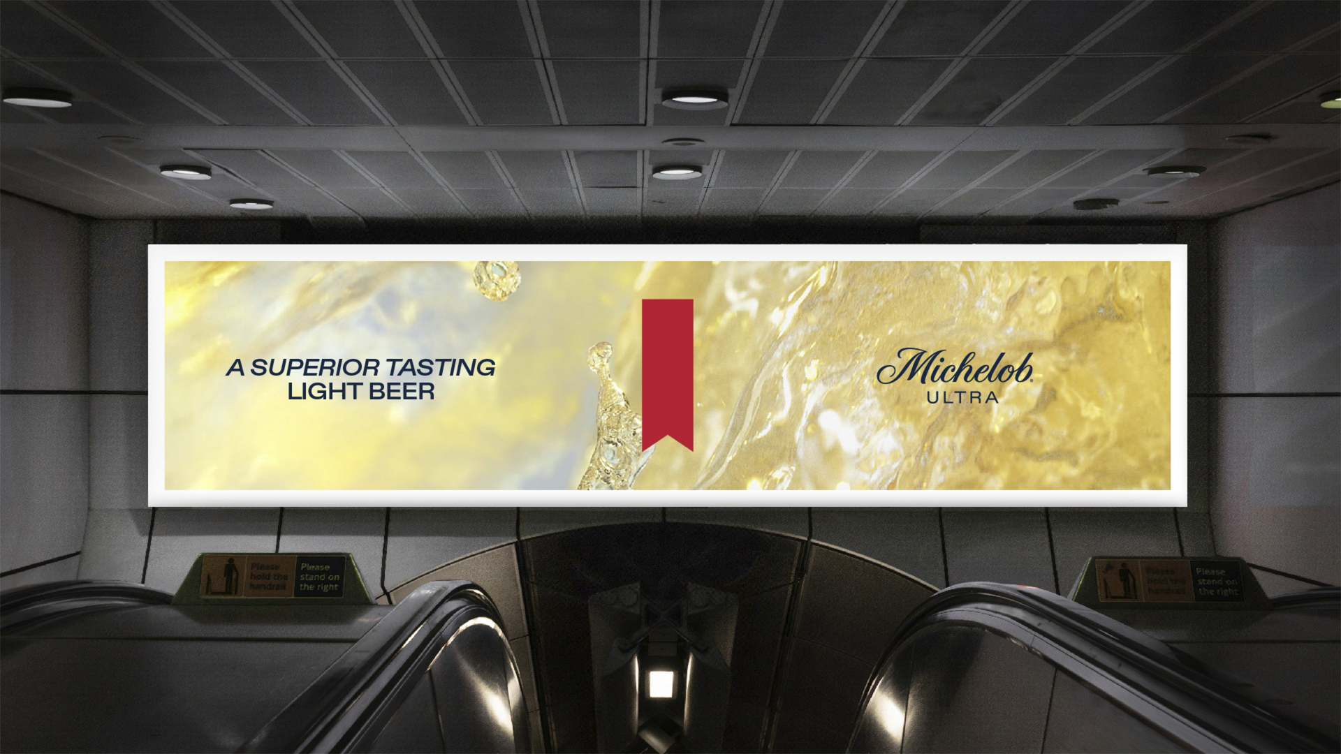
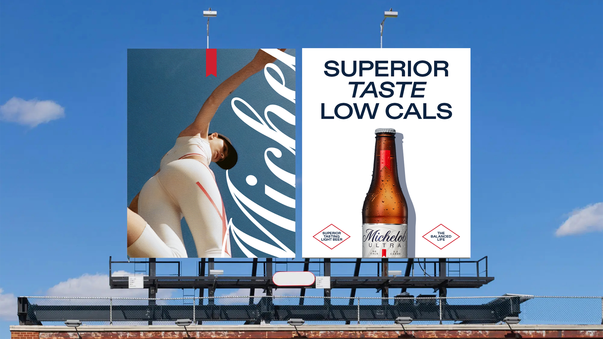
Michelob Masterbrand VIS
@ Tatil Design de Ideias
Michelob Ultra isn’t just a beer—it’s a mindset. A brand that embraces balance, where well-being and social life go hand in hand. As it continues expanding globally, the challenge was to refine its visual identity in a way that stayed true to its core while opening the door to a broader lifestyle narrative.
The evolution focused on amplifying Michelob Ultra’s most distinctive asset: the ribbon. Rather than reinventing it, the goal was to elevate it—transforming it into a confident, instantly recognizable signature that embodies the brand’s premium yet approachable character.
This vision came to life through a fresh photographic direction, capturing real, unfiltered moments where movement and celebration naturally intersect. The imagery blends the energy of an active lifestyle with the effortless cool of social gatherings—always light, dynamic, and genuine. Every detail was designed to resonate with those seeking both wellness and indulgence, proving that balance isn’t about sacrifice; it’s about enjoying it all.
More than just a visual refresh, this evolution gave Michelob Ultra a stronger, more unified presence across markets. It now confidently owns a space where beer and well-being coexist—where staying active, connecting with friends, and savoring the moment are all part of the same experience.
++ TATIL DESIGN DE IDEIAS
Creative Director
Daniel Souza
Creative Team
João Augusto Zanin, Regys Lima, and Victor deBone
Copywriting
Gustavo Feyer
Account Management
Jessica Moura and Thaiz Crepaldi
Creative Director
Daniel Souza
Creative Team
João Augusto Zanin, Regys Lima, and Victor deBone
Copywriting
Gustavo Feyer
Account Management
Jessica Moura and Thaiz Crepaldi


Hello, world! =)
I graduated at ESDI/UERJ back in 2002 and I have always been interested in visual and corporate identities. Since then, I have been working with design offices and agencies, helping to create or reveal the most diverse brands and their histories, whether they are local or global, and always looking for means to create strong and relevant connections between these brands and people.
Throughout this process, I realized that collaboration is the ultimate way to innovate. It was joining forces with some of the greatest people I had the pleasure to work with that I have been able to develop projects of visual identity, branding, packaging, shopper marketing, signage and design thinking for big clients such as Rio2016 Olympic Committee, Coca-Cola, Firjan, Globonews , GSK, Motorola, EBX Group, Petrobras, Shell Brasil, Unilever and TIM, among others.
I still believe that the simplest ideas are still the ones with greatest impact. They have the potential to surprise, attract, and captivate. Less is more. But it takes a lot of work and dedication so the simple is not just simpleton.
Professional Background
TÁTIL DESIGN DE IDEIAS
JUL. 2019 » MAR. 2024
Creative Director for International Accounts
Brand Experience • Branding • Visual Identity Systems • Packaging.
Main Clients:
Danone; AB Inbev; P&G; Ontier.
GEOMETRY GLOBAL RJ
OCT. 2016 » MAY 2018
Head of Design
Brand Experience • Branding • Visual Identity Systems • Packaging.
Main Clients:
The Coca-Cola Company; Fiocruz; Globonews; Firjan; GSK; Kimberley Clark; Motorola; Unilever.
PONTIFICAL CATHOLIC UNIVERSITY OF RIO DE JANEIRO (PUC-RJ)
AUG. 2014 » AUG. 2016
Assistant teacher.
TÁTIL DESIGN DE IDEIAS
JUL. 2009 » SEP. 2016
Creative Manager
Brand Experience • Branding • Visual Identity Systems • Packaging.
Main Clients:
The Coca-Cola Company; Rio2016 Olympic and Paralympic Games Organizing Committee; TIM Brasil; EBX Group.
SOTER DESIGN
JUL. 2002 » JUL. 2009
Senior Designer
Editorial • Signaling • Exhibitions • Visual Identity Systems.
Main Clients:
Rio2016 Olympic and Paralympic Games Organizing Committee; Brazilian Olympic Committee; Barbosa, Müssnich & Aragão Lawyers; Carioca Christiani-Nielsen Engineering; Shell Brasil; Petrobras; Intelig Telecom; IETS.
CAMPOS GERAIS PUBLICAÇÕES E COMUNICAÇÃO
JAN. 2000 » JAN. 2001
Internship
Editorial • Signaling • Exhibitions • Visual Identity Systems.
Main Clients:
Record Publisher; MAM-RJ; MIAN-RJ; National Historical Museum.
Daniel Souza © 2025.
All rights reserved.